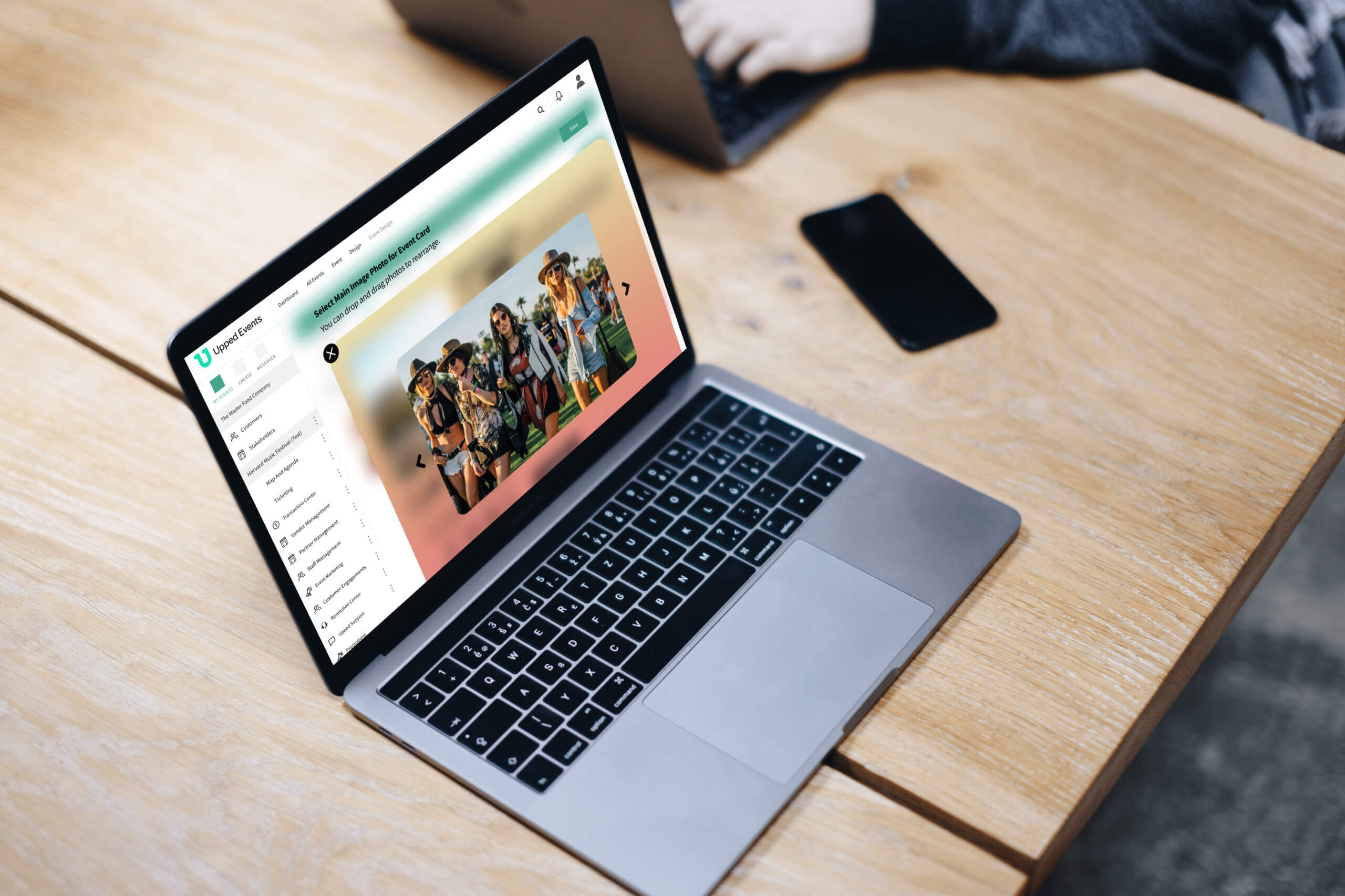
Upped Events Event Card Templates
An event experience automation platform.
Background
Upped Events is a new event management platform with the goal of serving all the needs of the event owners and event attendees.
The platform consists of:
- A master portal for the administrators of Upped
- A backend portal for the event organizers
- A ticket embed link that event owners can embed into their business website for event attendees to purchase tickets
- A tablet that the event staff utilizes for transactions during the event
- An app for event attendees to use during the event for real-time updates and making purchases
My Role
I am one of about ten UX designers. I meet frequently with the product owner to talk through the requirements, and best approaches for designs. We continuously iterate until we feel we have met the needs of the users and business.
This specific project is the redesign of the event card section for the event owner.
The Problems
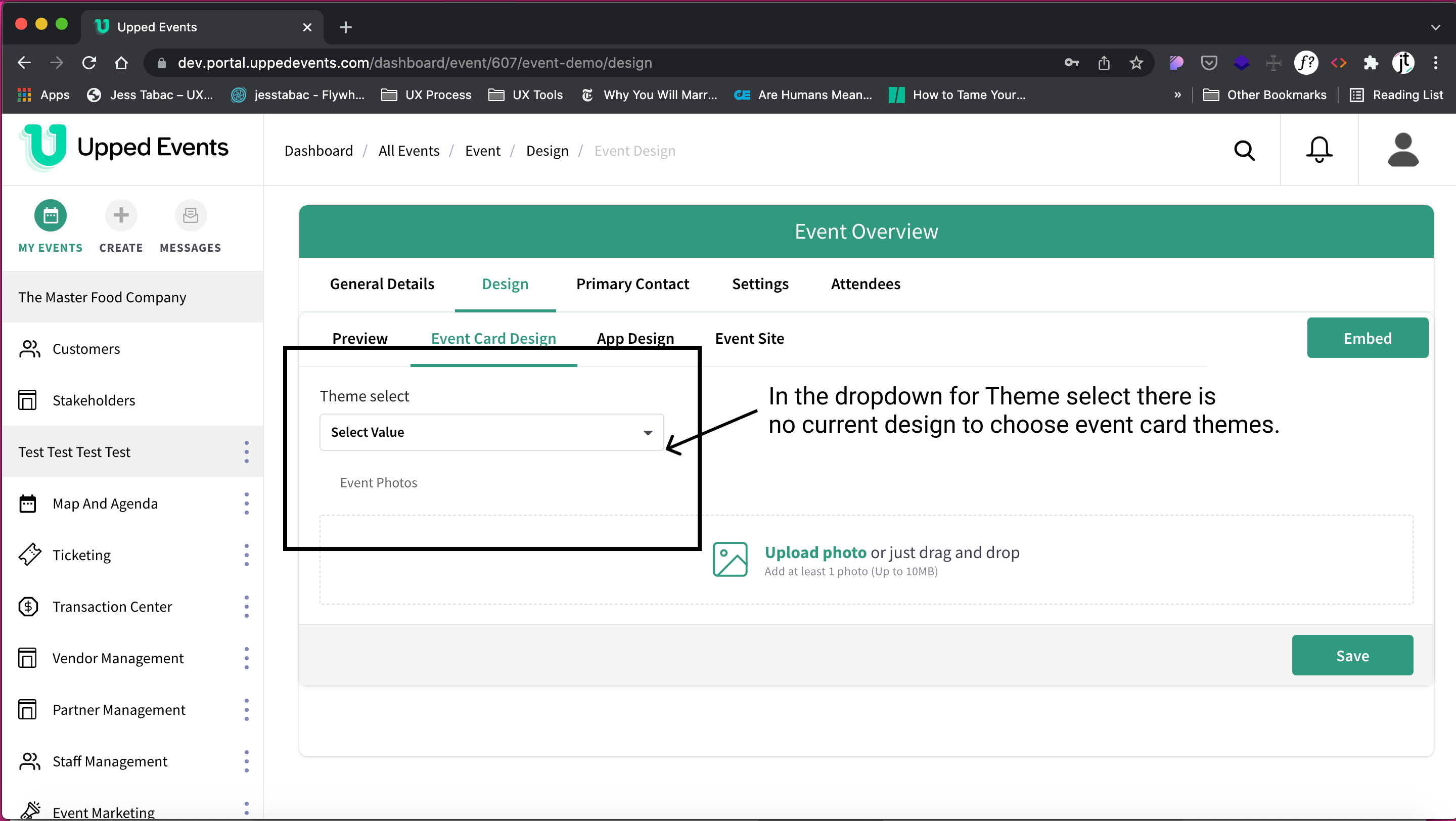
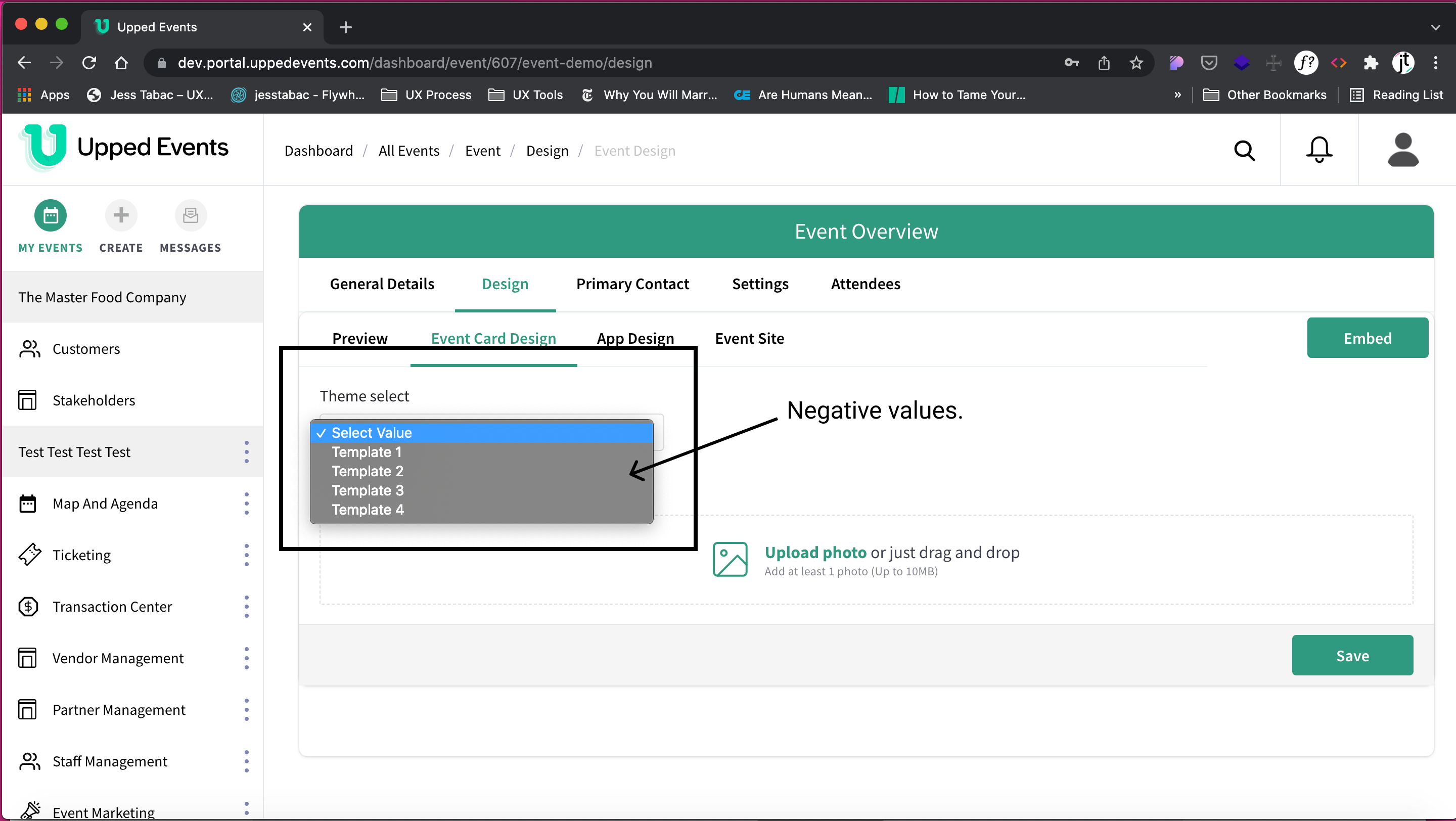
1. The current event card template page has negative values for template choice.
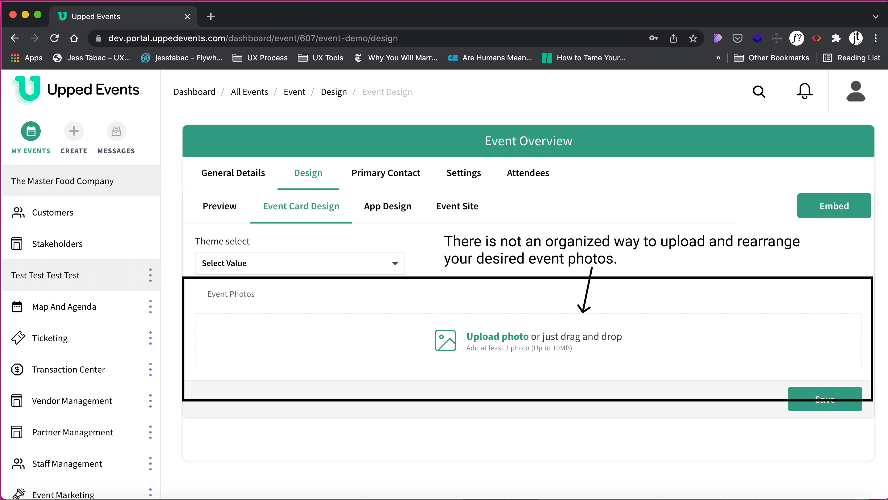
2. The current design to upload photos does not allow for Preview to see how they will appear in the event card template.
The Need
Event Card Templates
Event Owner needs to view the various styles of event card templates available.
Event Pictures
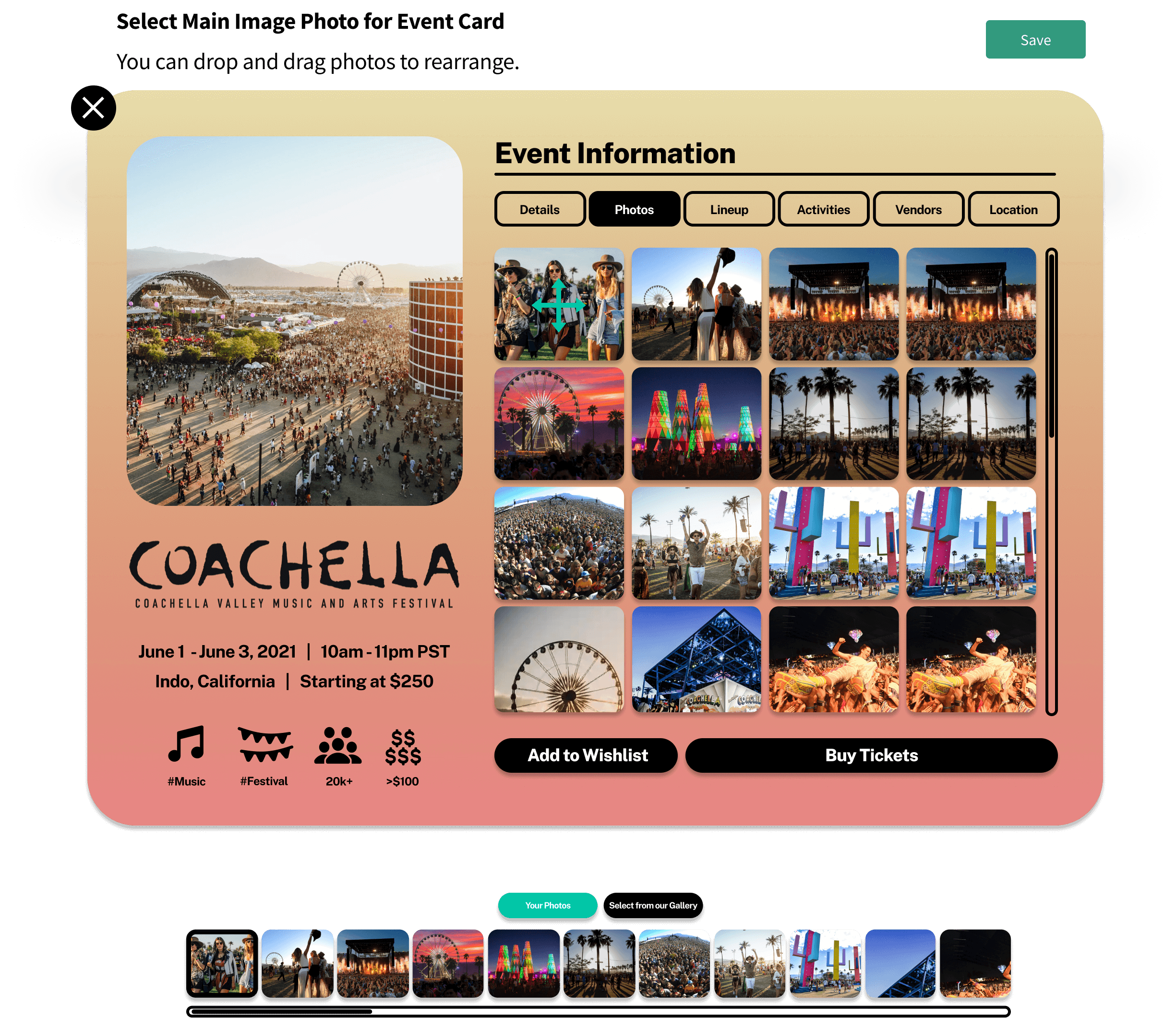
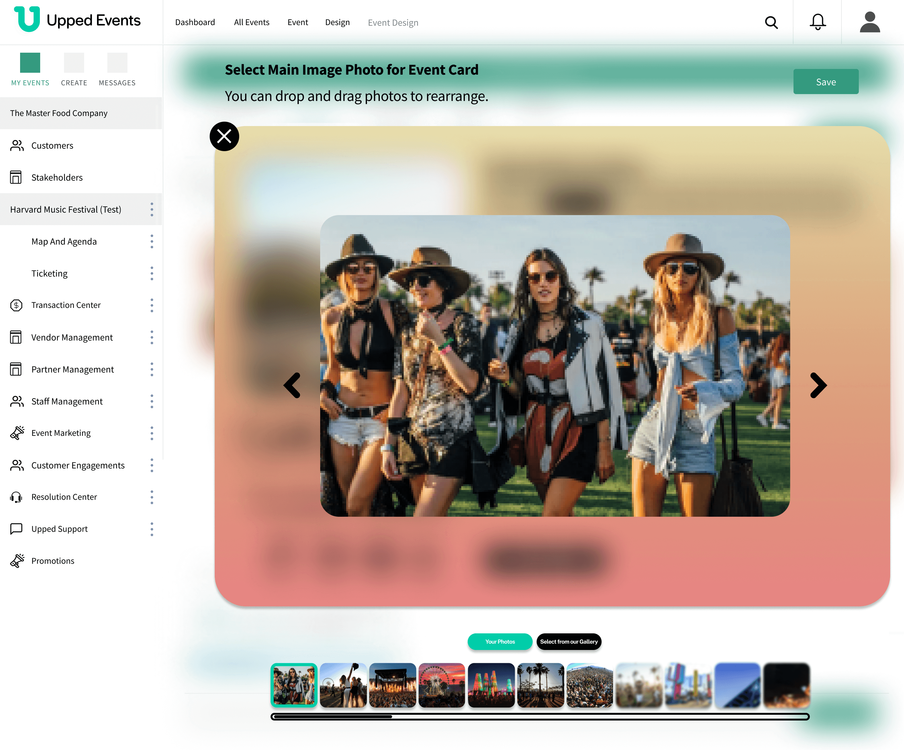
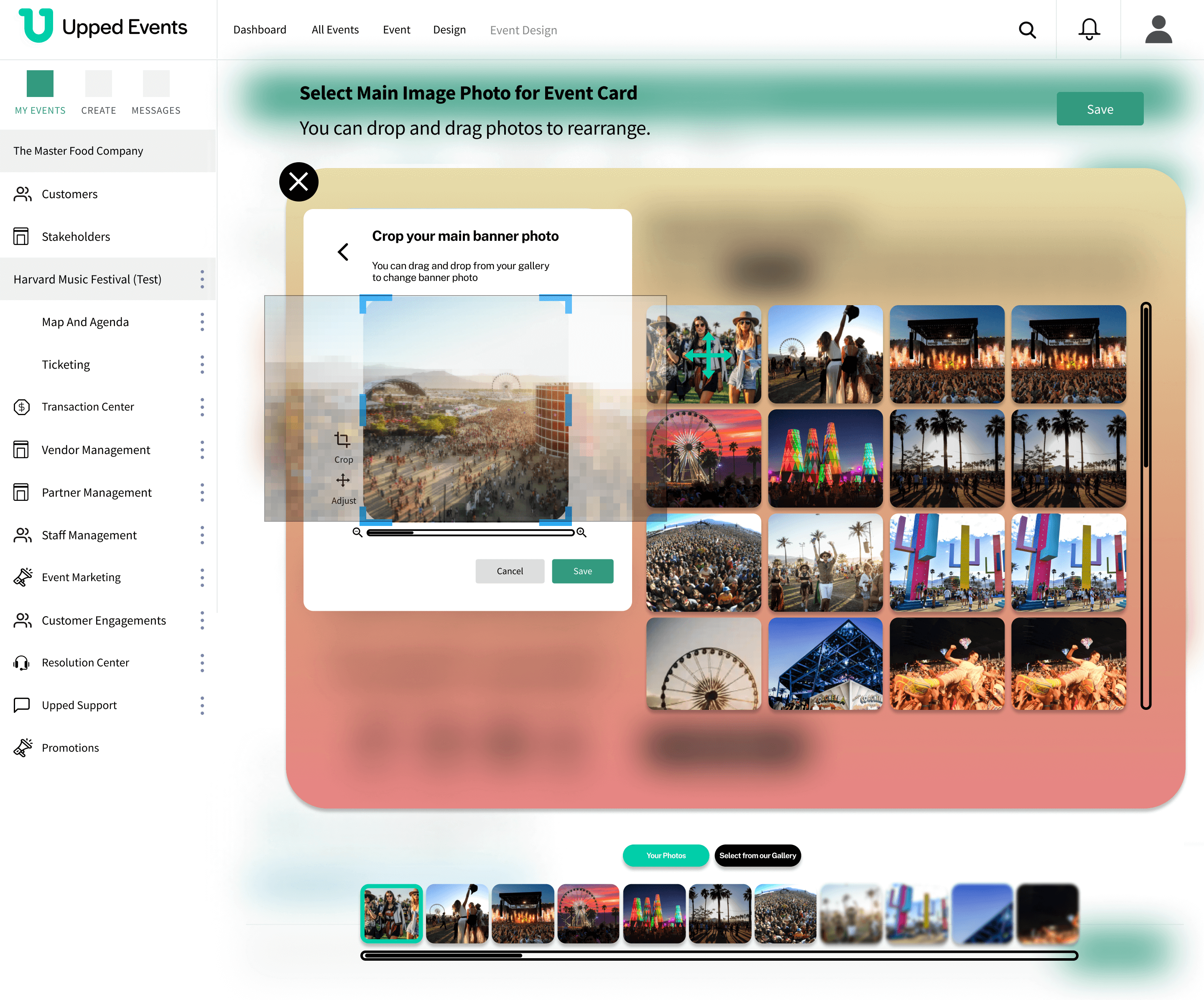
Event Owner needs to upload and rearrange event pictures in Preview mode in the card template.
The Solution
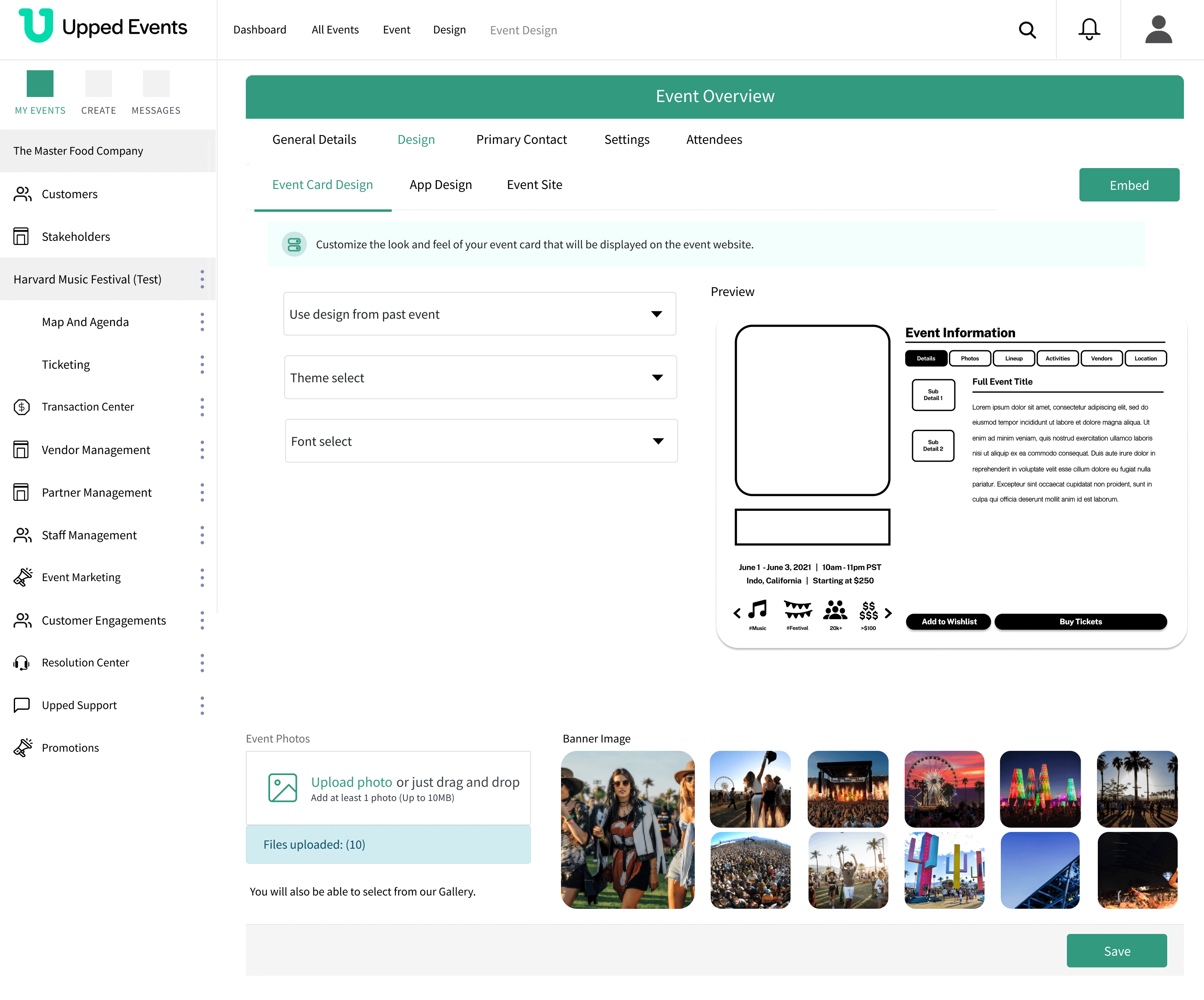
Design the flows for an Event Owner choosing their event card template and uploading their event photos.
Some examples of final designs
How'd we get here?
Event Card Template
Before Redesignn

There were negative values in the event card template dropdown instead of the various event card templates.
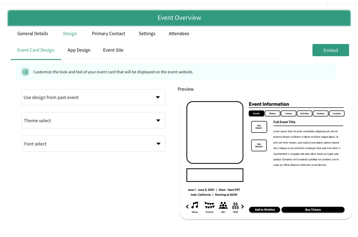
First Iteration
There was a requirement change to view templates.
As a result:
- Two more dropdowns were added
- A blank event card template was added
Design template layout?
Key aspect: Figuring out the way the event card templates are arranged to choose from
Are you not overwhelmed yourself just by looking at all 18 below?

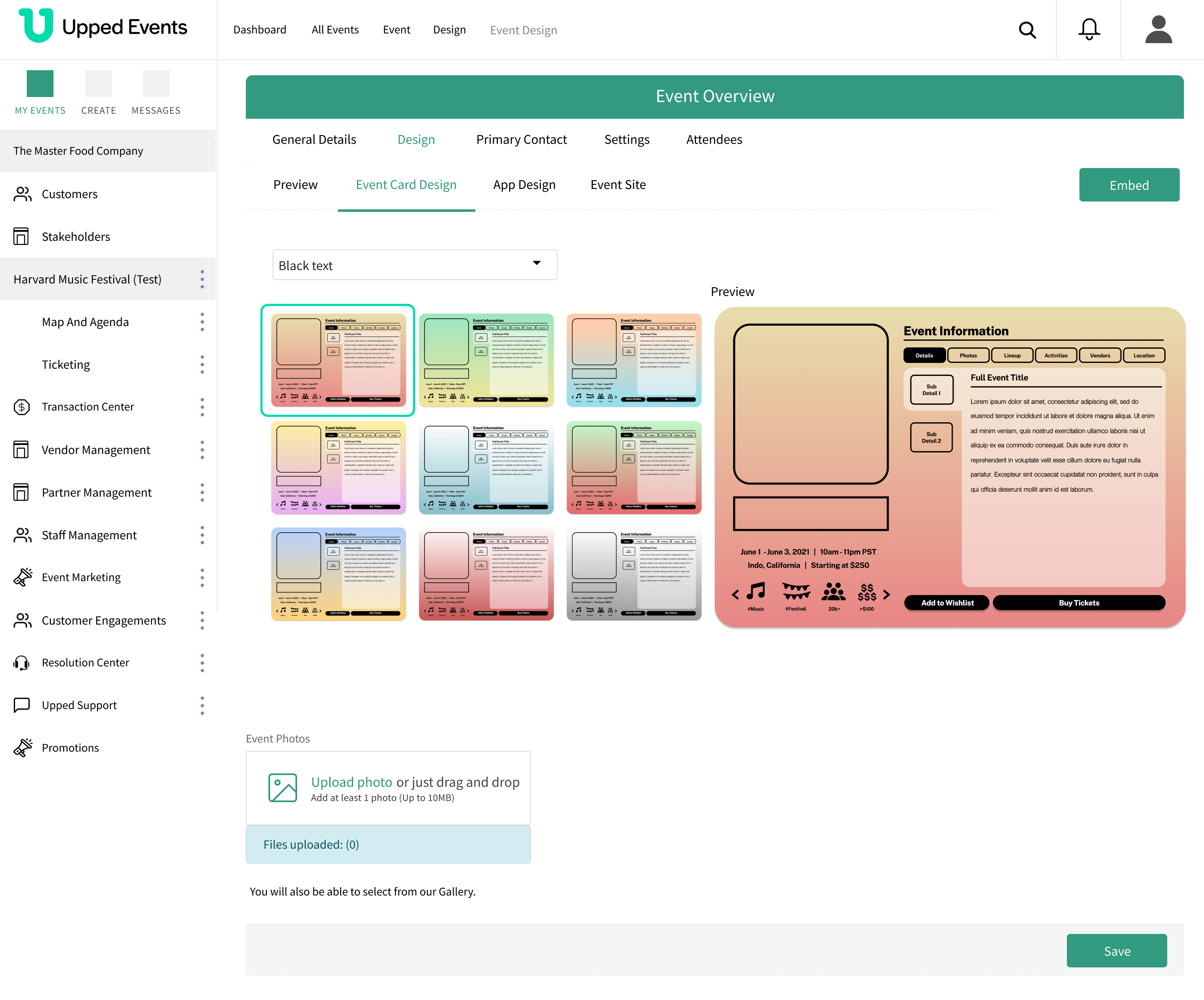
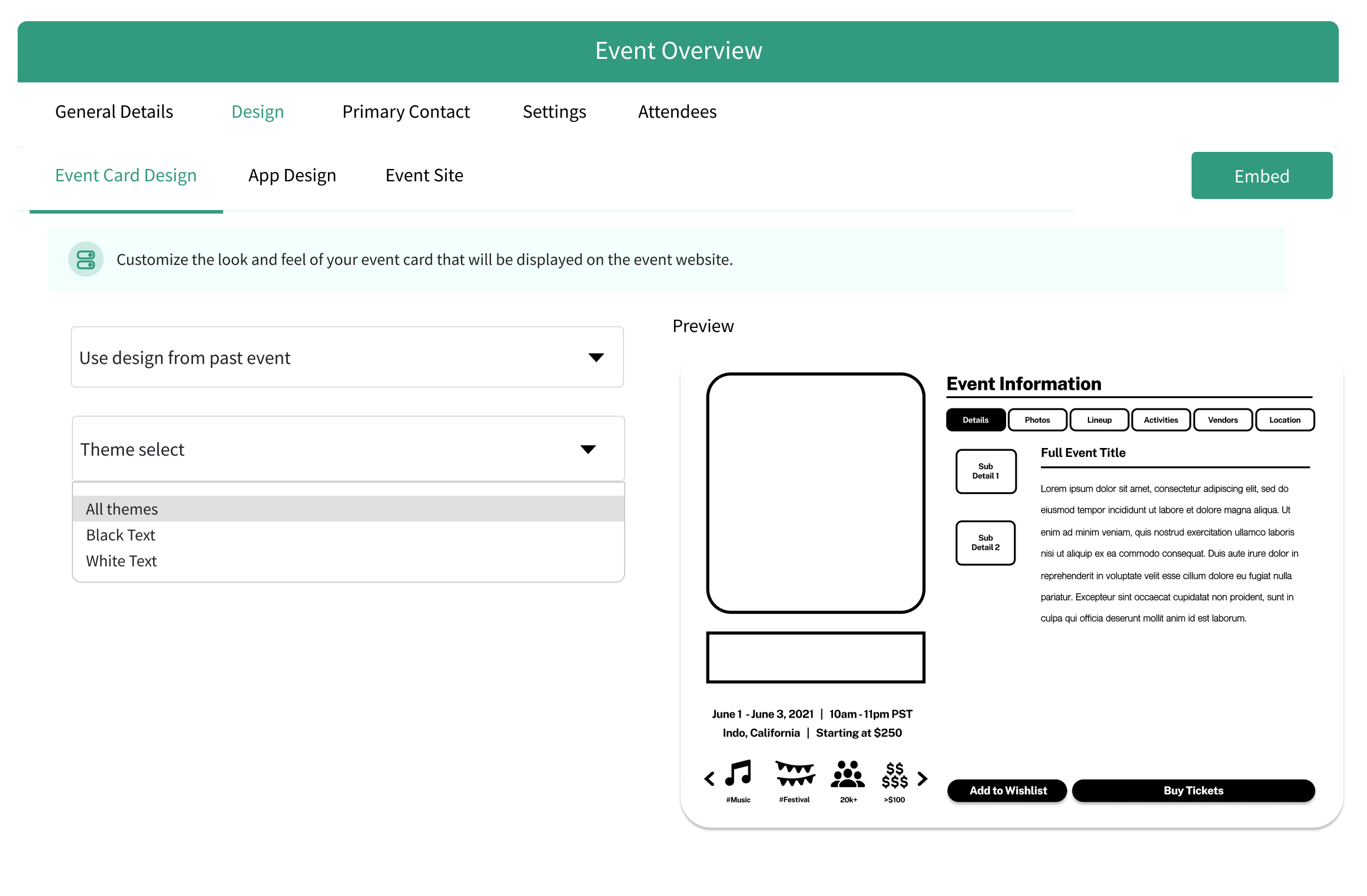
For the redesign, the Theme select dropdown has three selectable layouts:
- All themes (18 templates at once)
- Black text (9 at once)
- White text (9 at once)
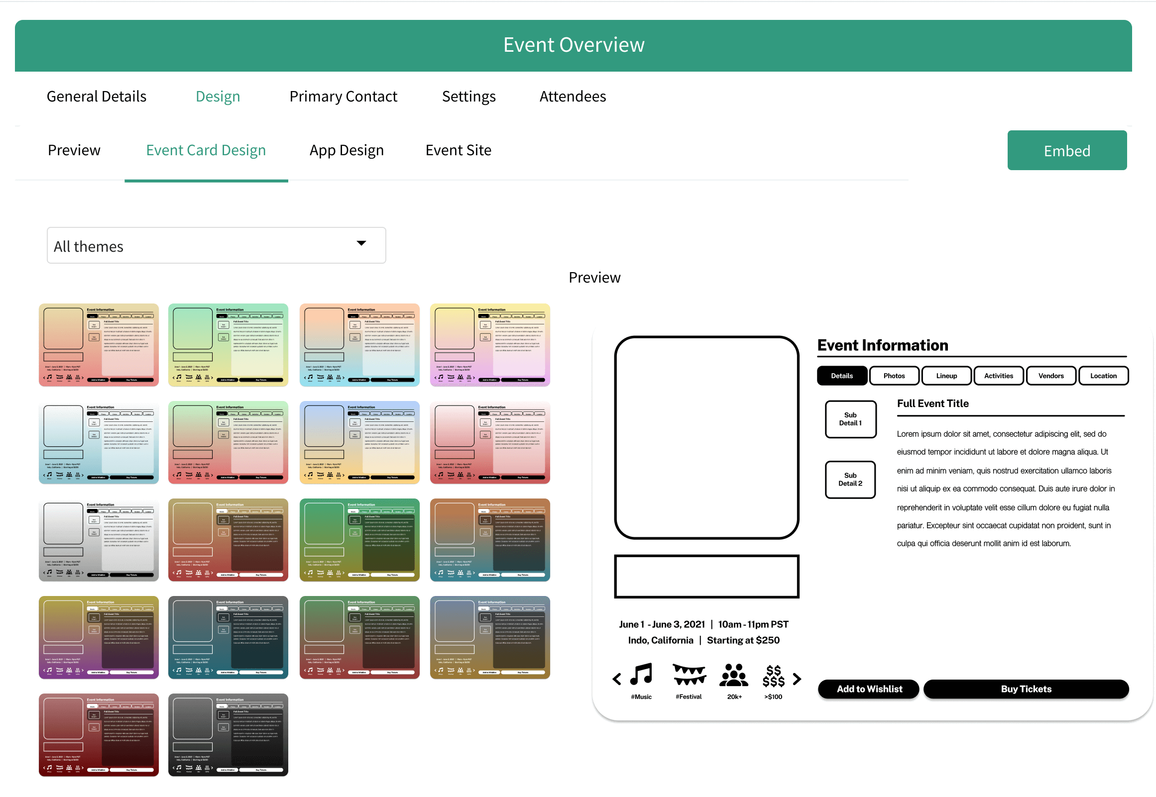
From there the user selects a template and the template layout appears in the right Preview section.
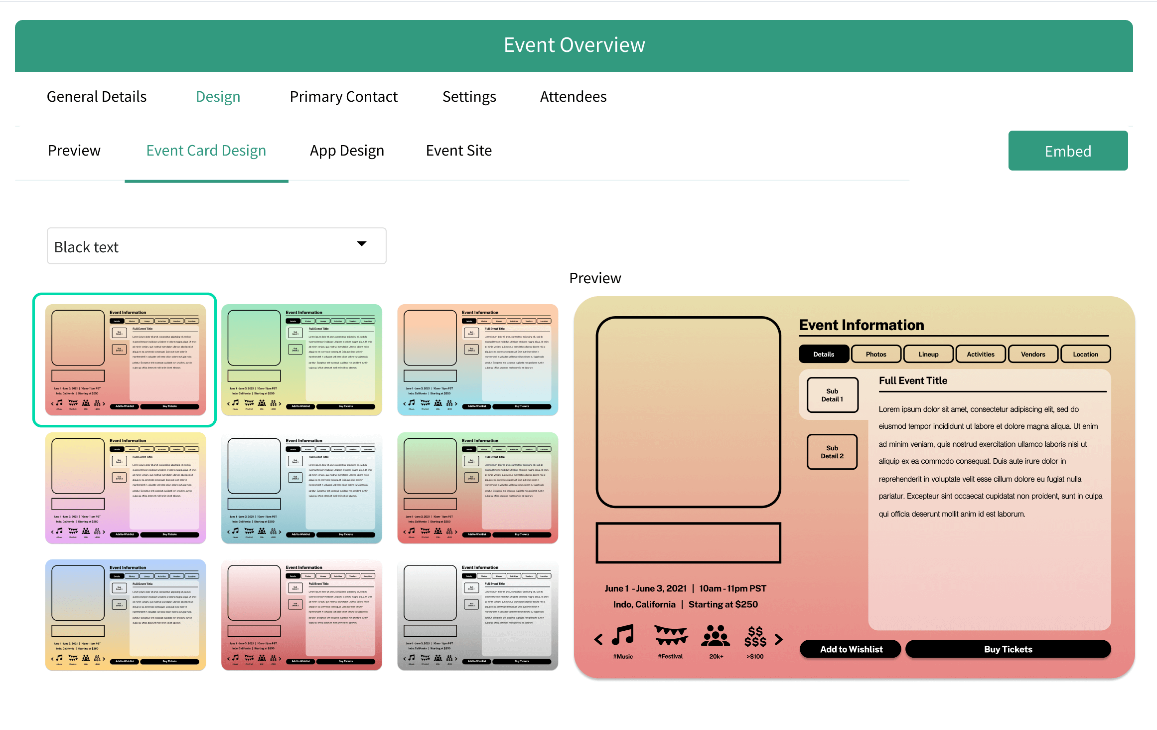
Getting a closer look
Enlarge
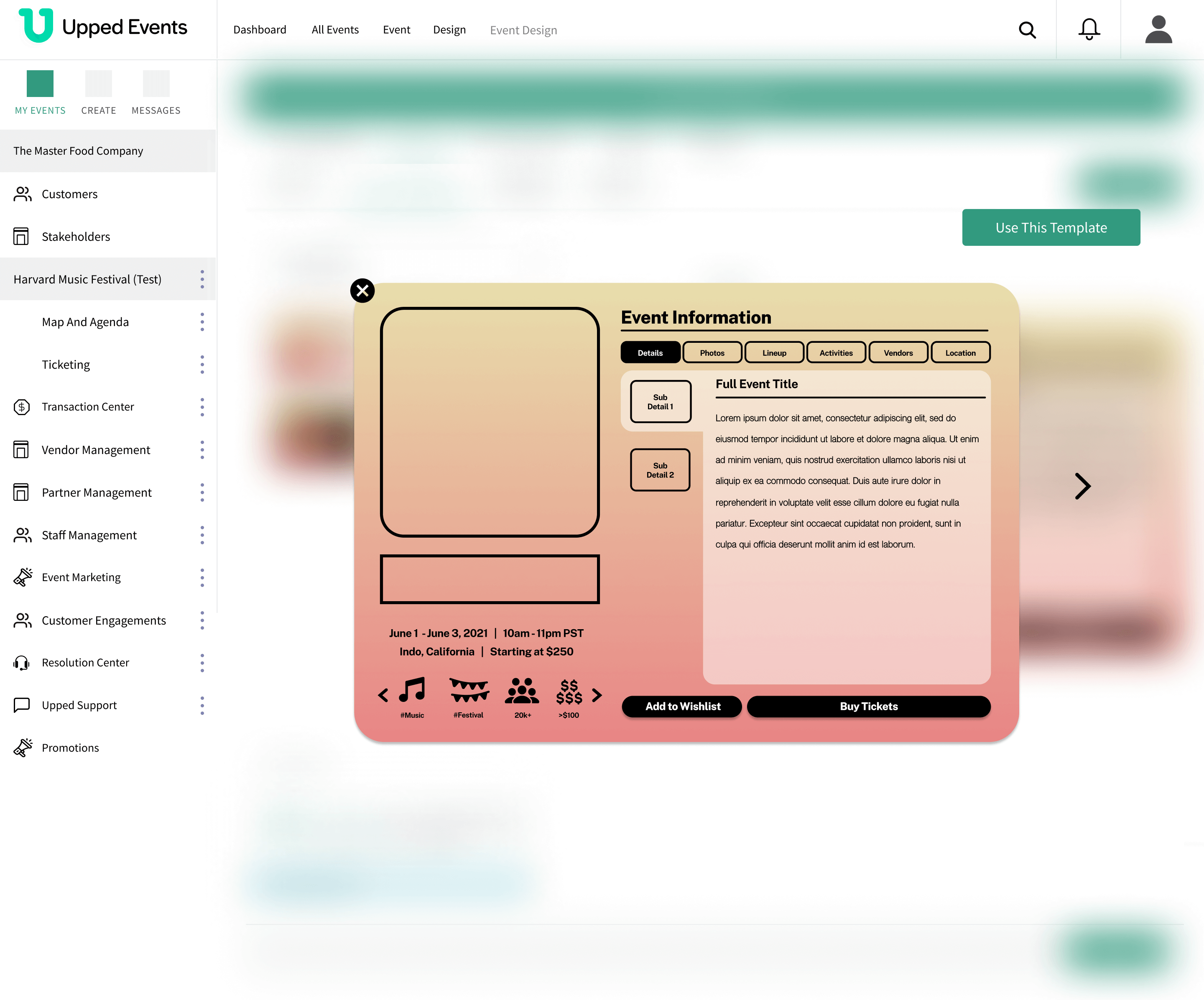
It's important that the event owner can enlarge the event template from the Preview section.
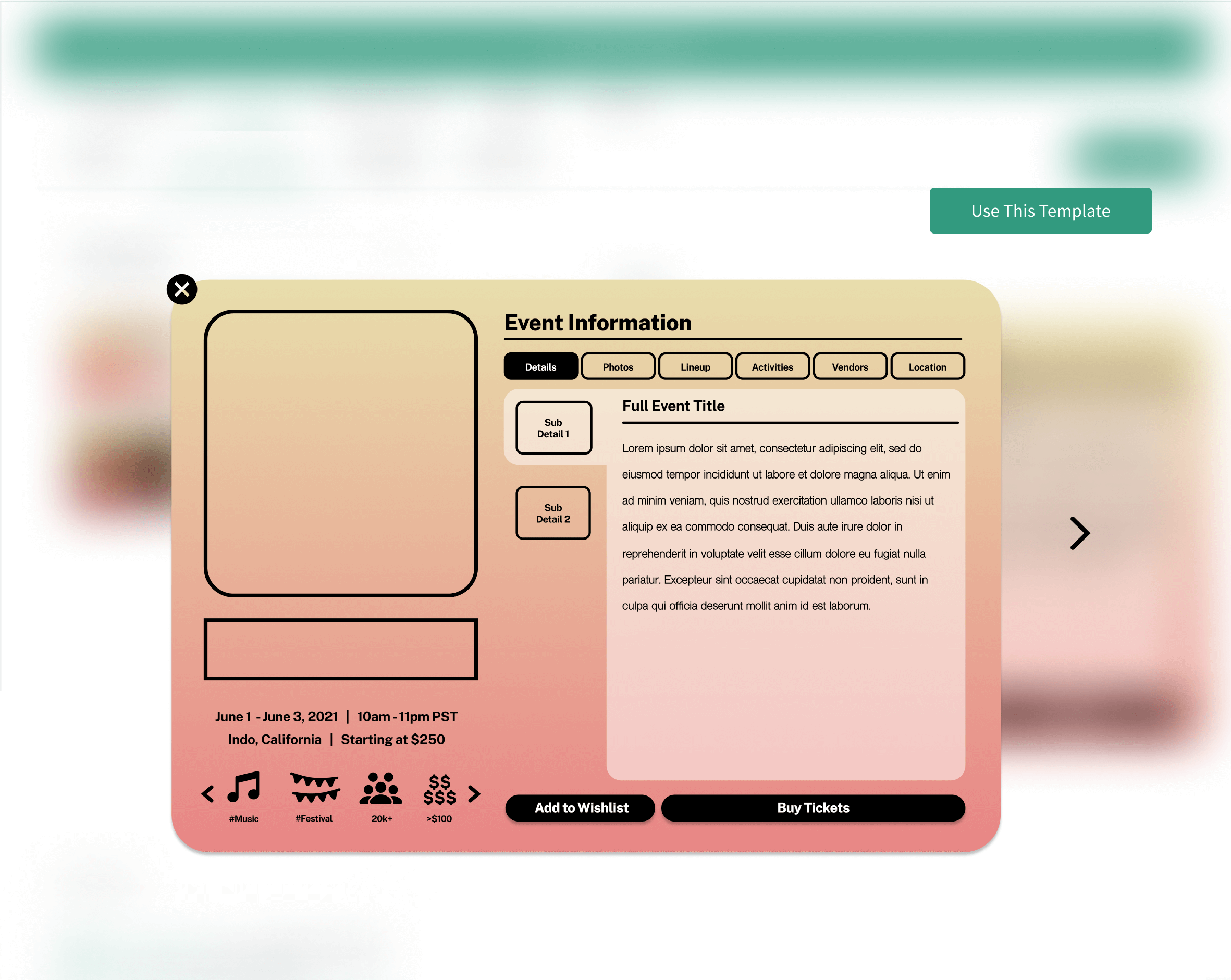
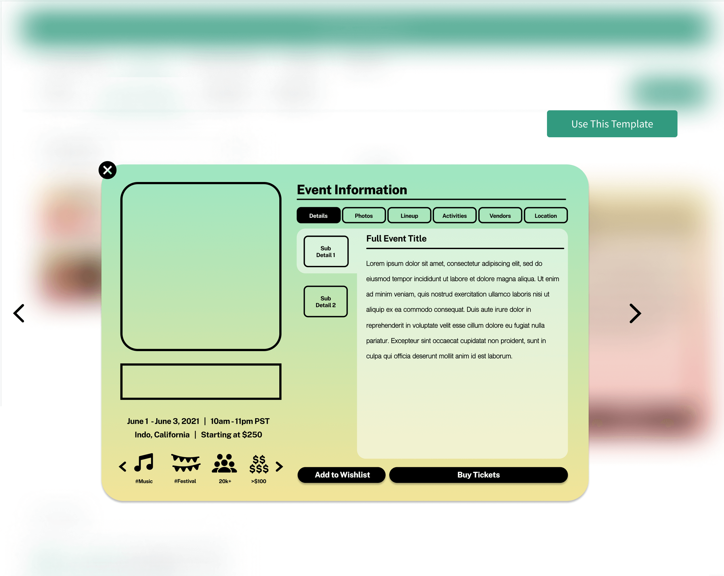
If the EO clicks on the template in the Preview section, it will enlarge and they can continue to view and select the templates from there.
Blurred Overlay
The site's overall design has a blurred background whenever an image is enlarged.
The blurred overlay from a different part of the website was originally designed, but by utilizing the Layer Blur feature in Figma, the applicable blur for this wireframe was designed.
Before
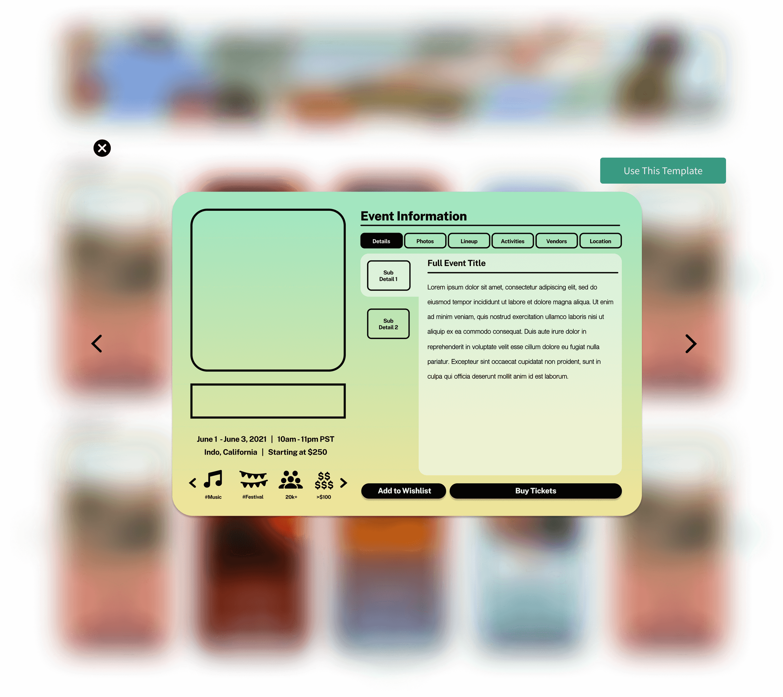
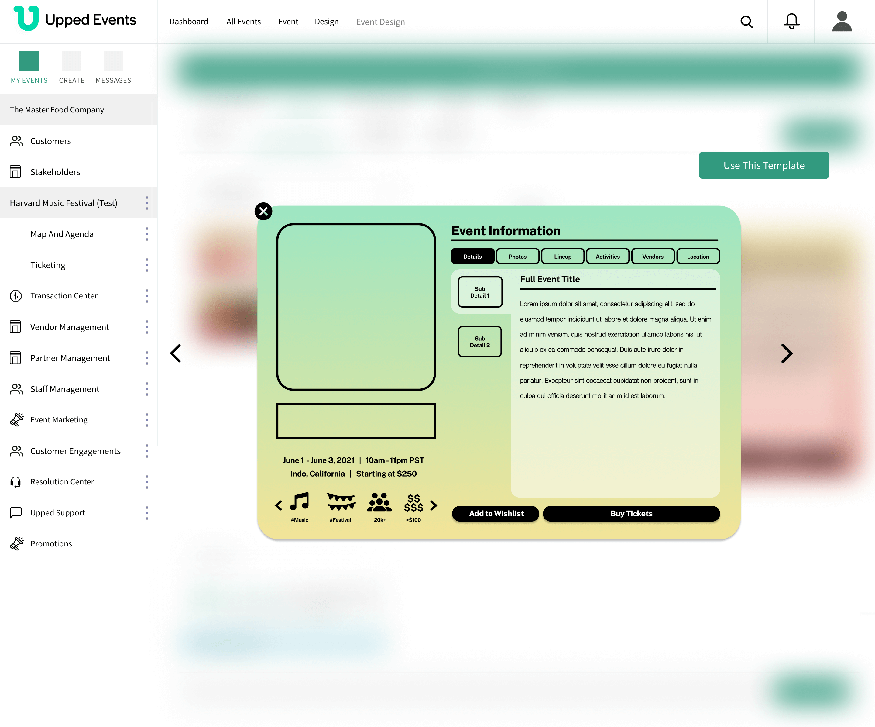
After
How'd we get here?
Photo Upload and Arrangement
Before Redesign

There was a method to upload event photos, but then what? How were they arranged on the event card template?
Iterations on ways to preview event photos
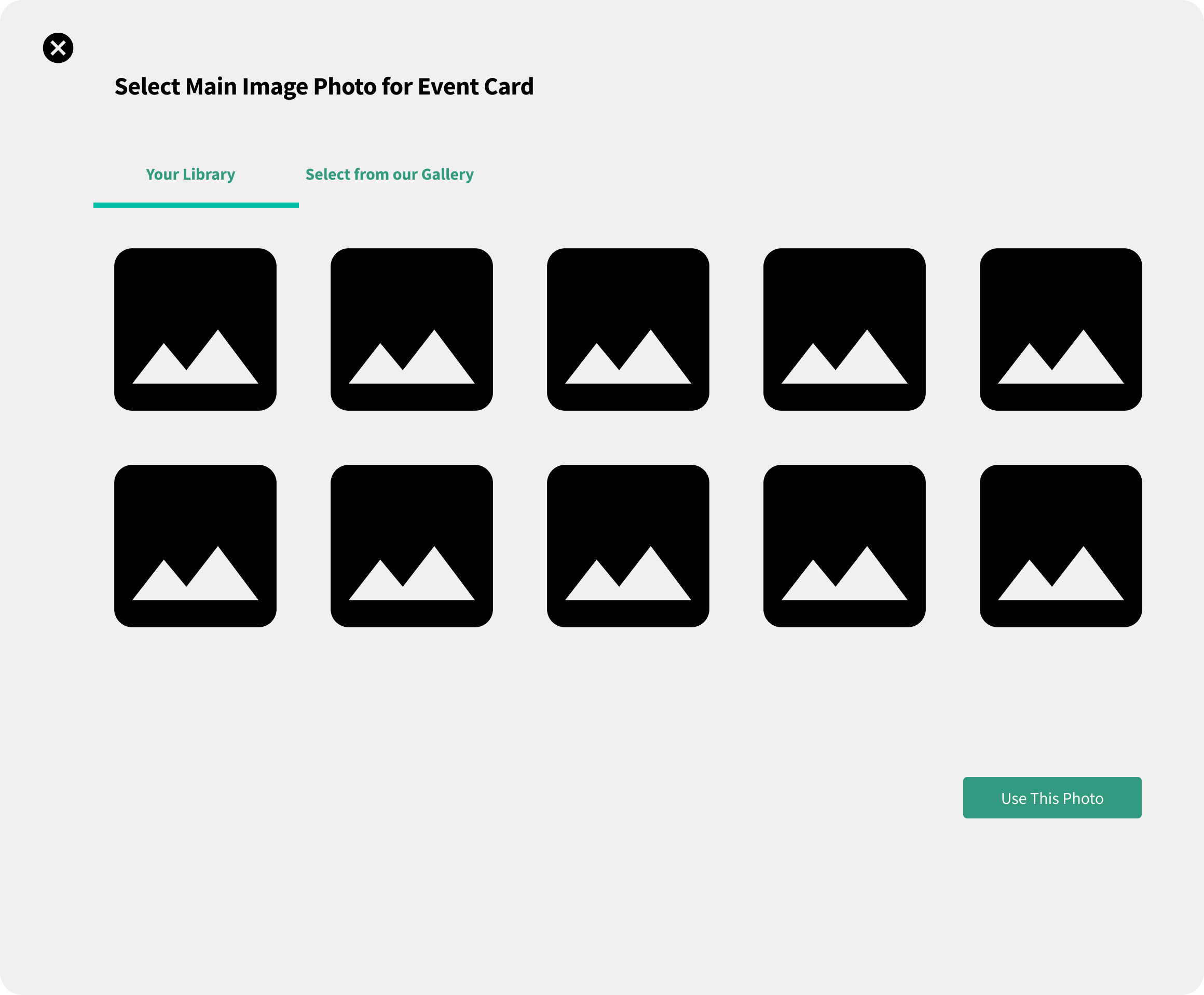
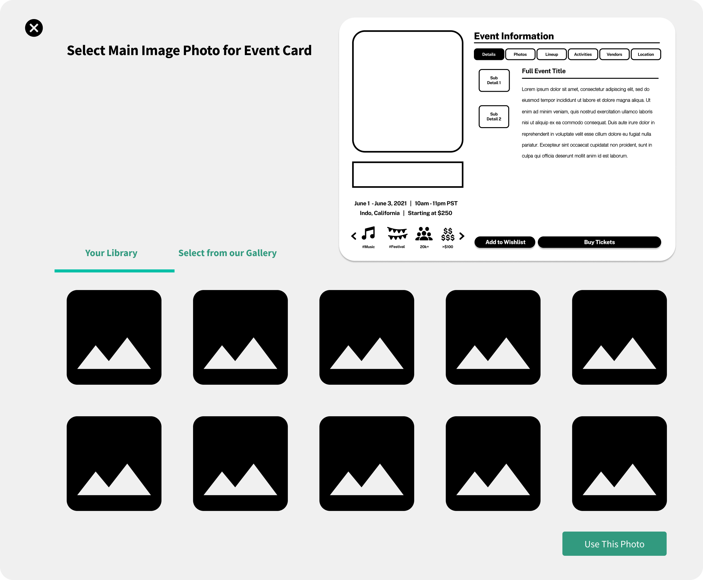
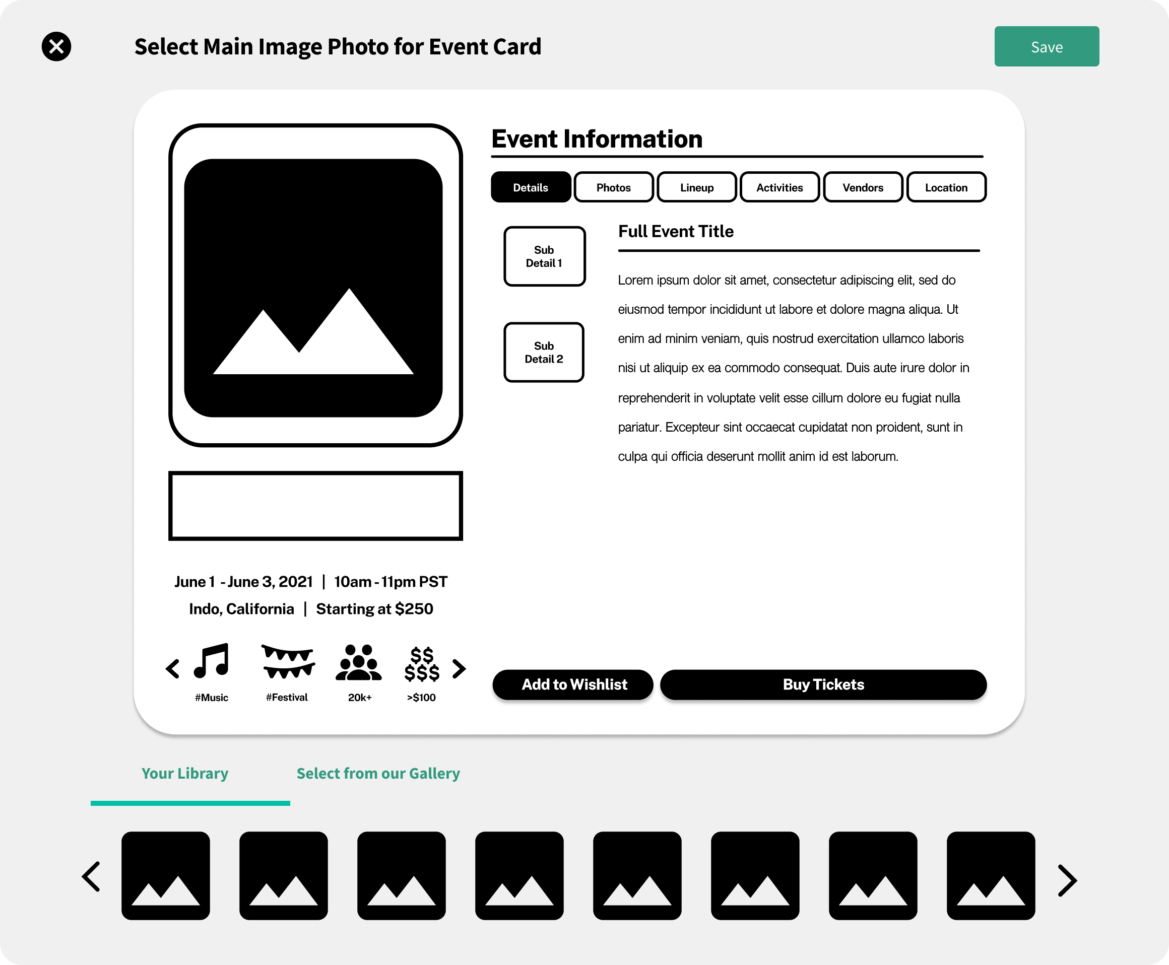
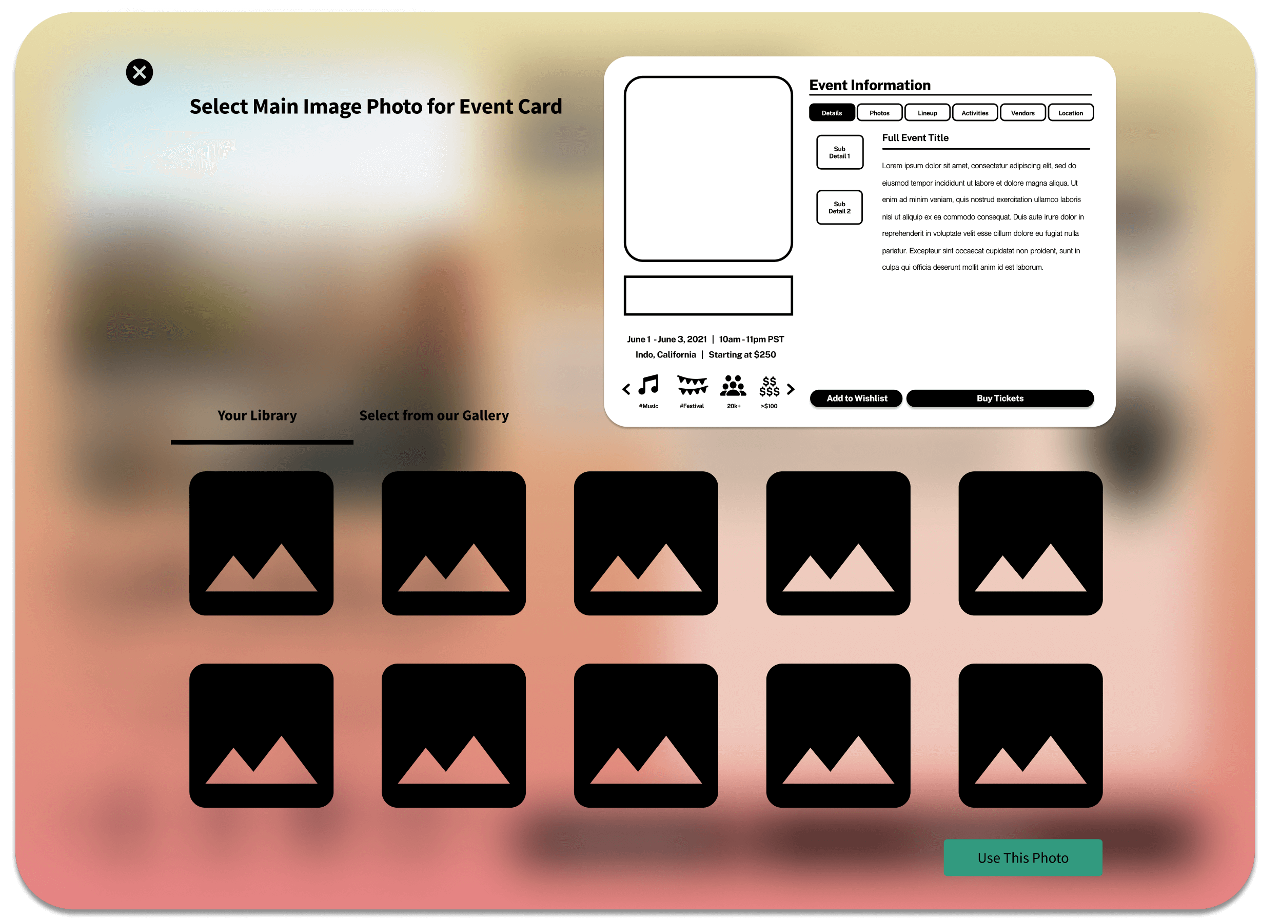
Iterating Continued...
The user also would need to crop their main banner photo upon initial upload. The question was WHERE and HOW LARGE to place the banner photo editor popup?
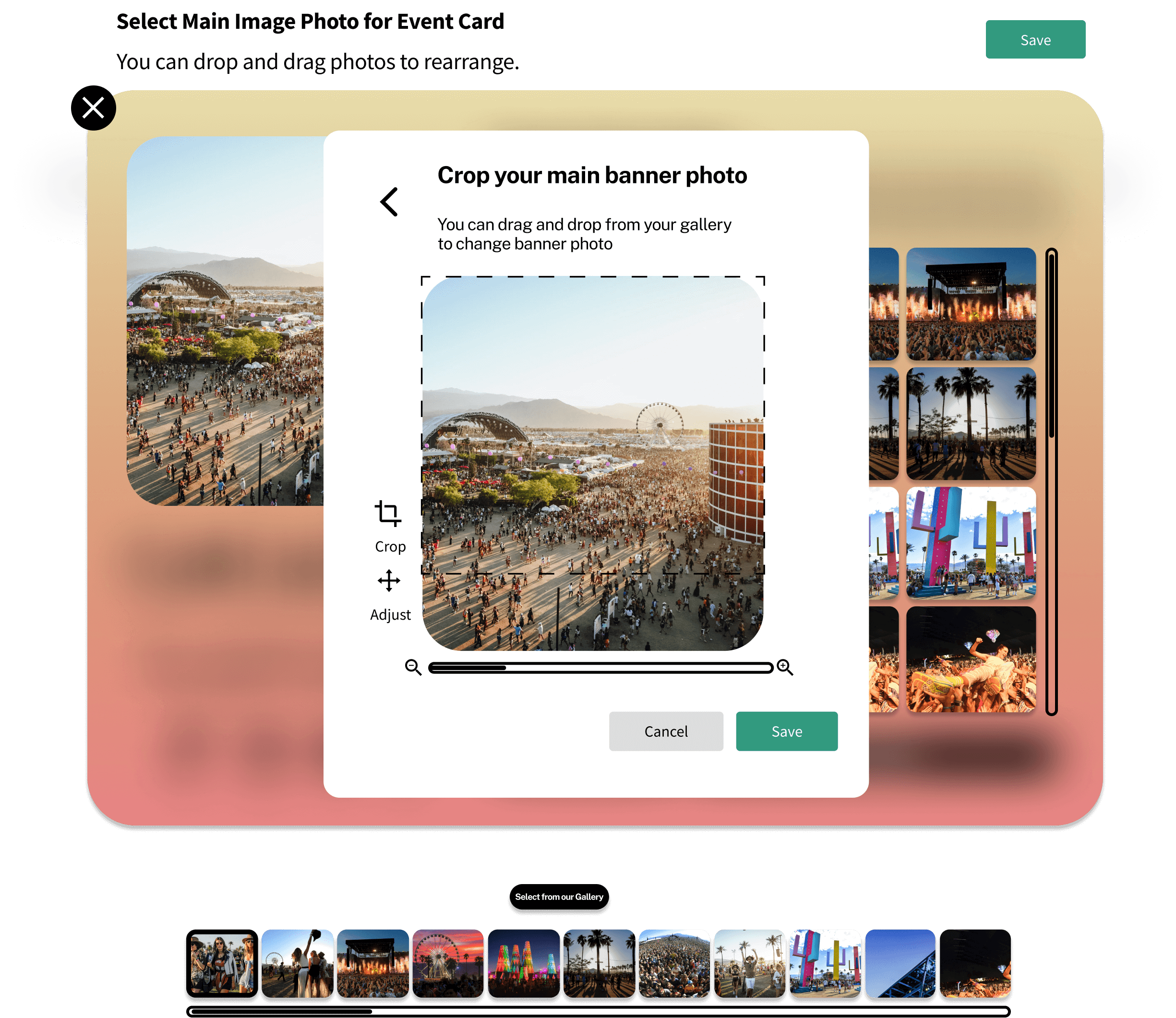
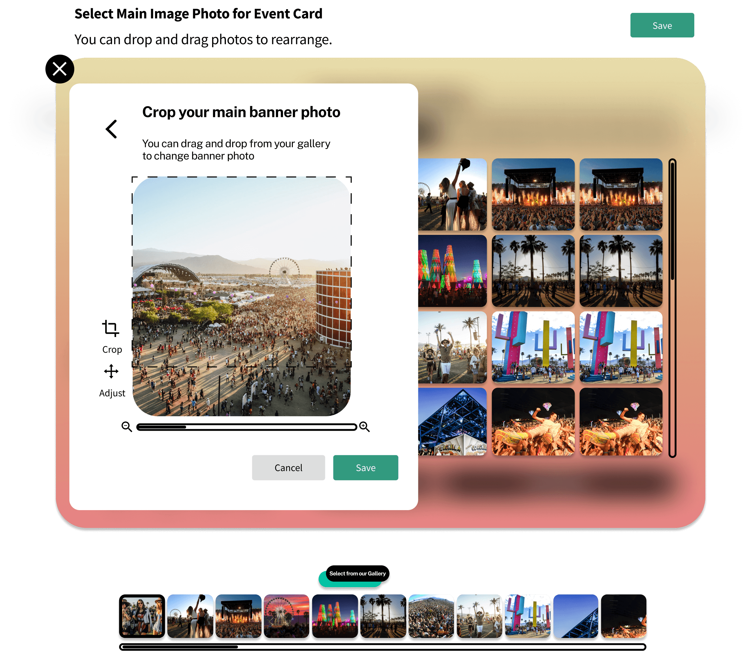
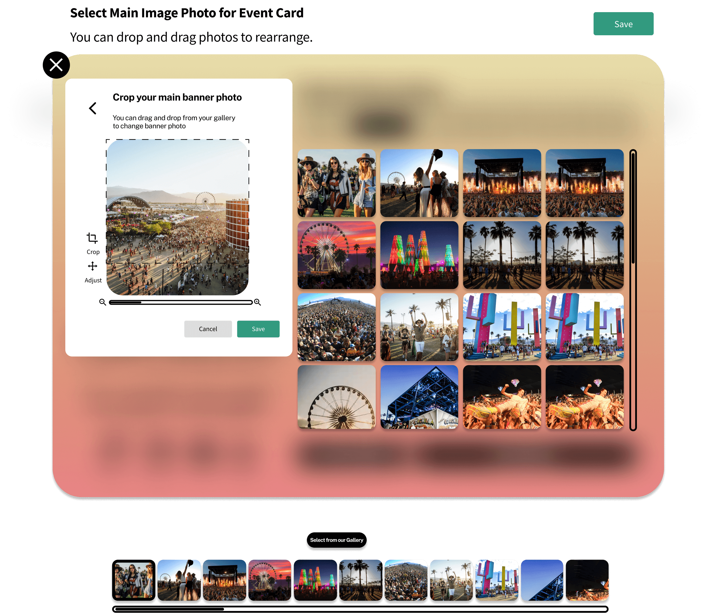
Final designs for photo preview
One last iteration
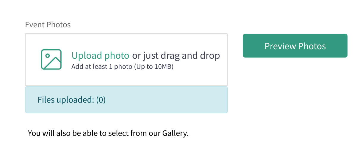
Initially, the redesign had the user upload their photos and select the "Preview Photos" button to go to the photo previewer.
For the final design, the photos are uploaded to the right to preview photos and delete any unwanted photos.
Before
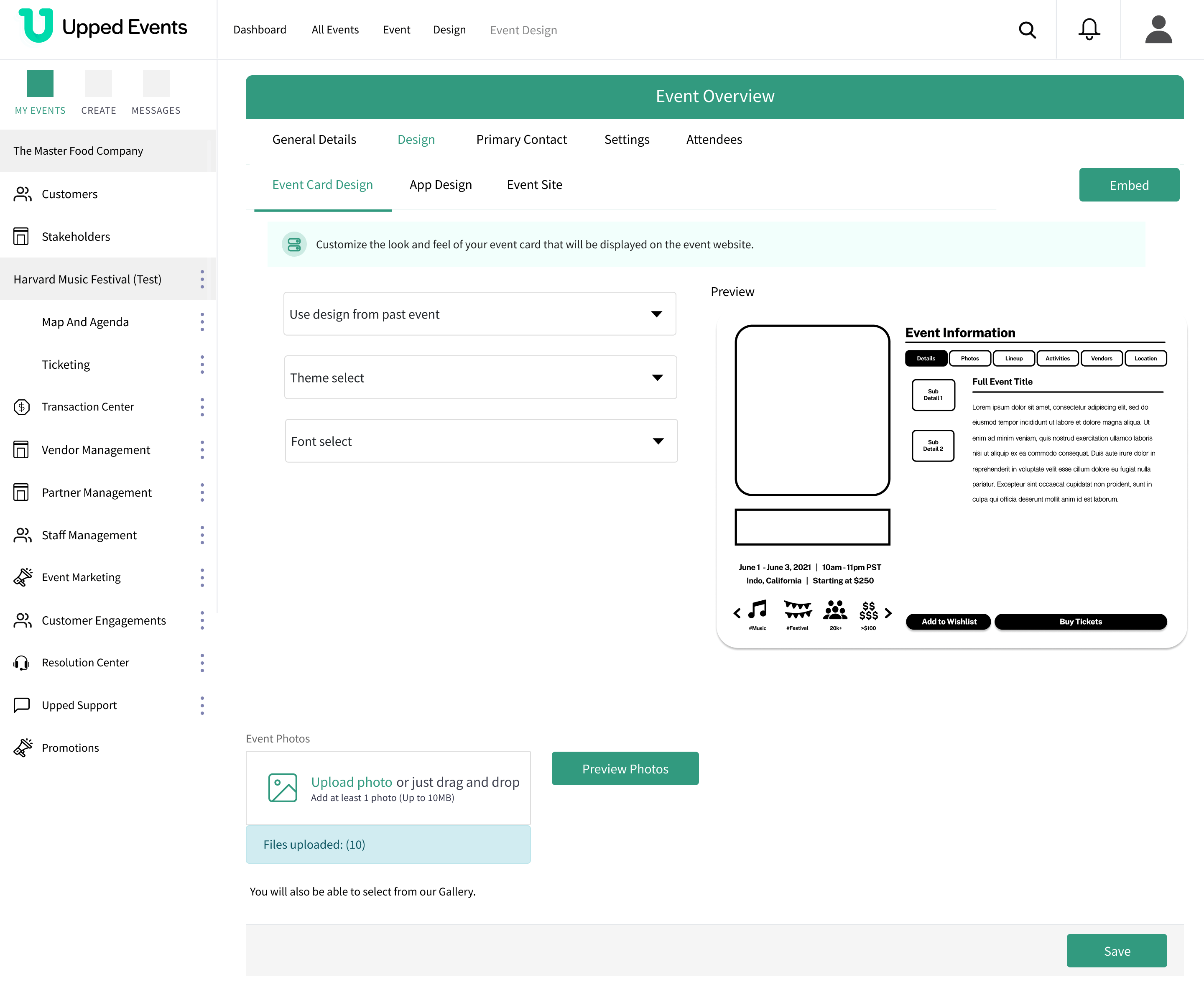
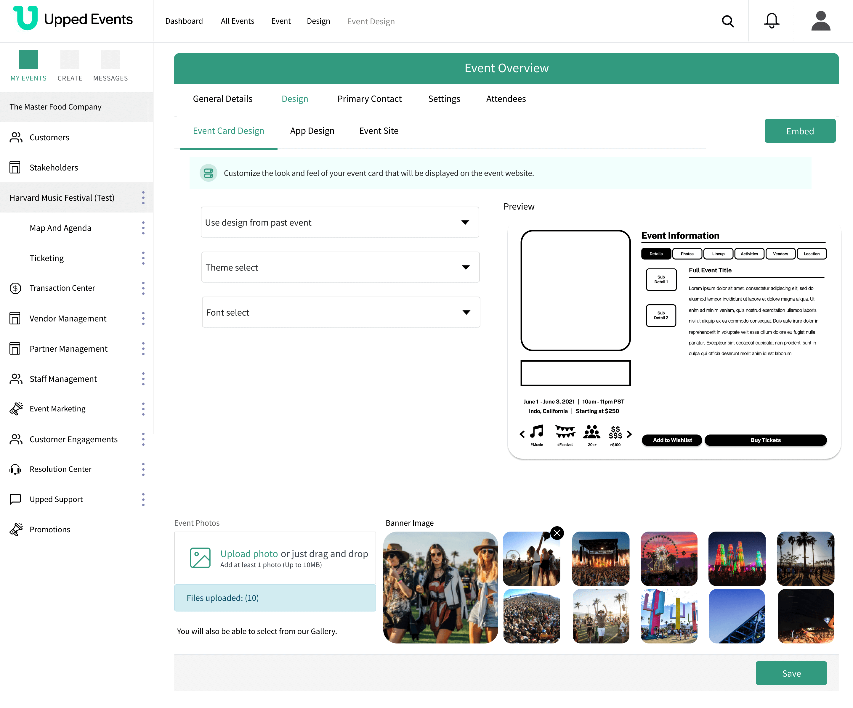
After
