Upped Events Attendee Checkout
Ticket and merch buying process for an event attendee
Background
Upped Events is a new event management platform with the goal of serving all the needs of the event owners and event attendees.

The platform consists of:
- A master portal for the administrators of Upped
- A backend portal for the event organizers
- A ticket embed link that event owners can embed into their business website for event attendees to purchase tickets
- A tablet that the event staff utilizes for transactions during the event
- An app for event attendees to use during the event for real-time updates and making purchases
I am one of about ten UX designers. I meet frequently with the product owner to talk through the requirements, and best approaches for designs, and continuously iterate until we feel we have met the needs of the users and business.
Product Requirement Update for Purchasing Tickets
This project began as a redesign of the merchandise section for the event-goer as they purchased tickets.
However, this evolved into:
- expanding the ticketing options
- adding a donations section and round-ups to the end of the order
- redesigning the merch section with scrolling and the ability to ship to the user
- expanding the order details/summary
- updating the UI throughout the flow
- designing for mobile
Below, you'll see the updated designs related to the features described above.
Ticketing

Starting Point
The original design for the ticketing page.

Redesign
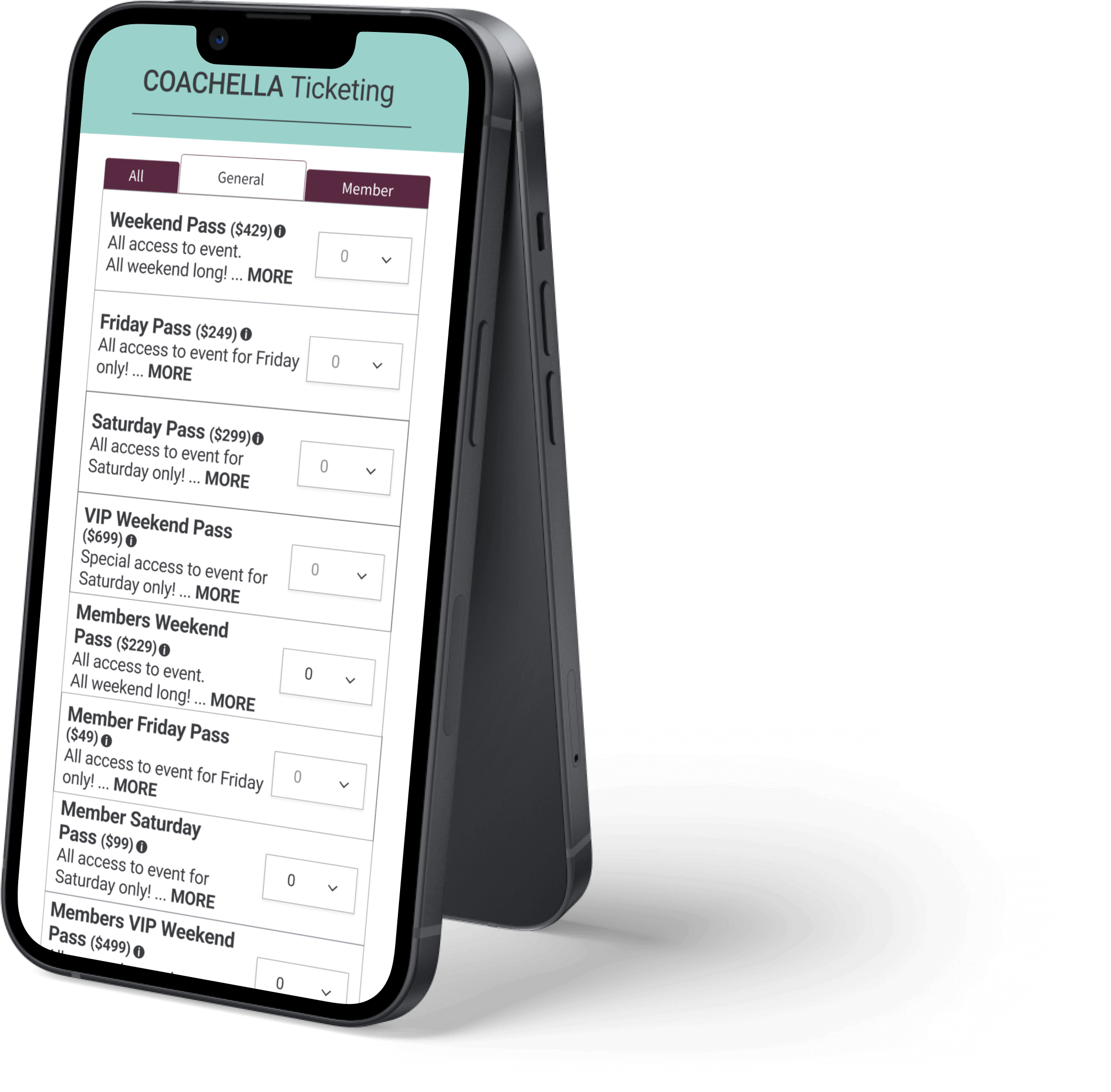
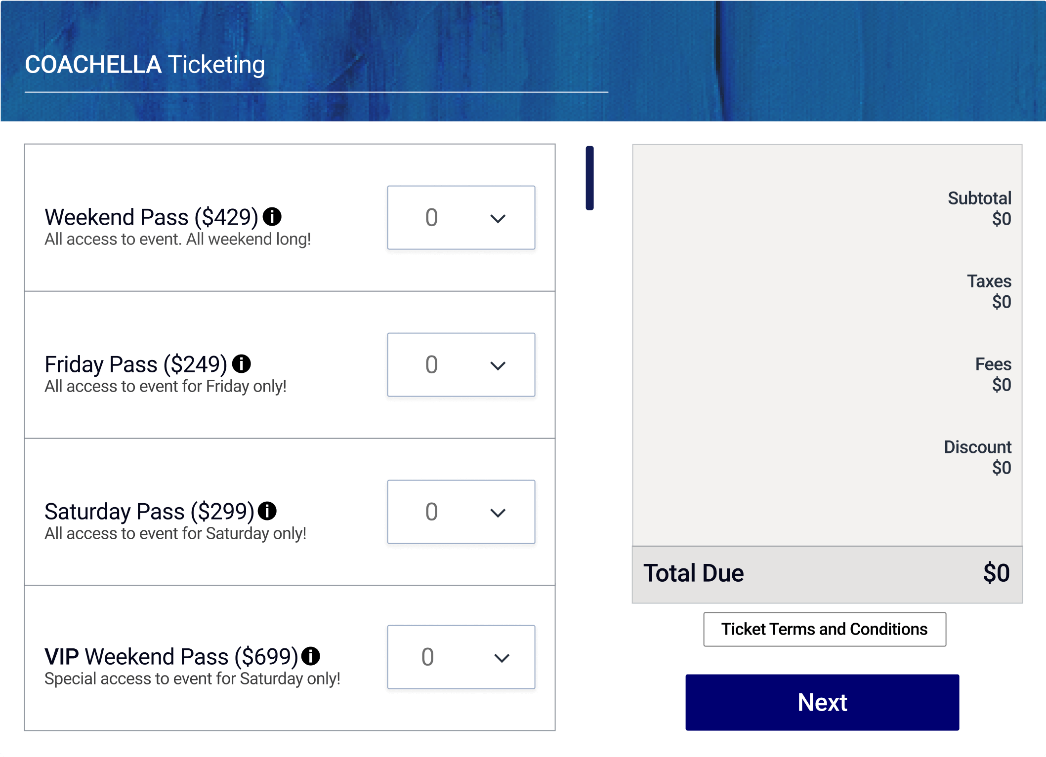
- Added a breadcrumb
- Added tabs for various ticketing types
- Designed the Order Total section more detailed for the user
- The user can extend the ticket description "More" or "Less"
A situation arose where the Event Owner needed special tickets released after certain event-goers logged in. So we designed for this circumstance.
Newly released tickets are boldened and the event-goer receives a message alerting them they've unlocked special tickets.

Donations

Newly Created Donations Section
The idea came about to add a Donations section as the event-goer went through their ticket-buying process. We designed for two circumstances.


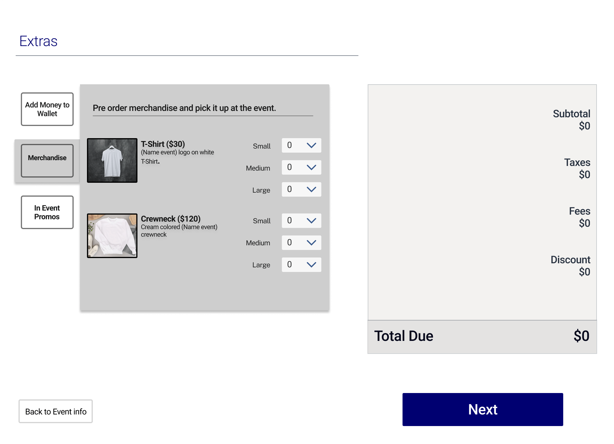
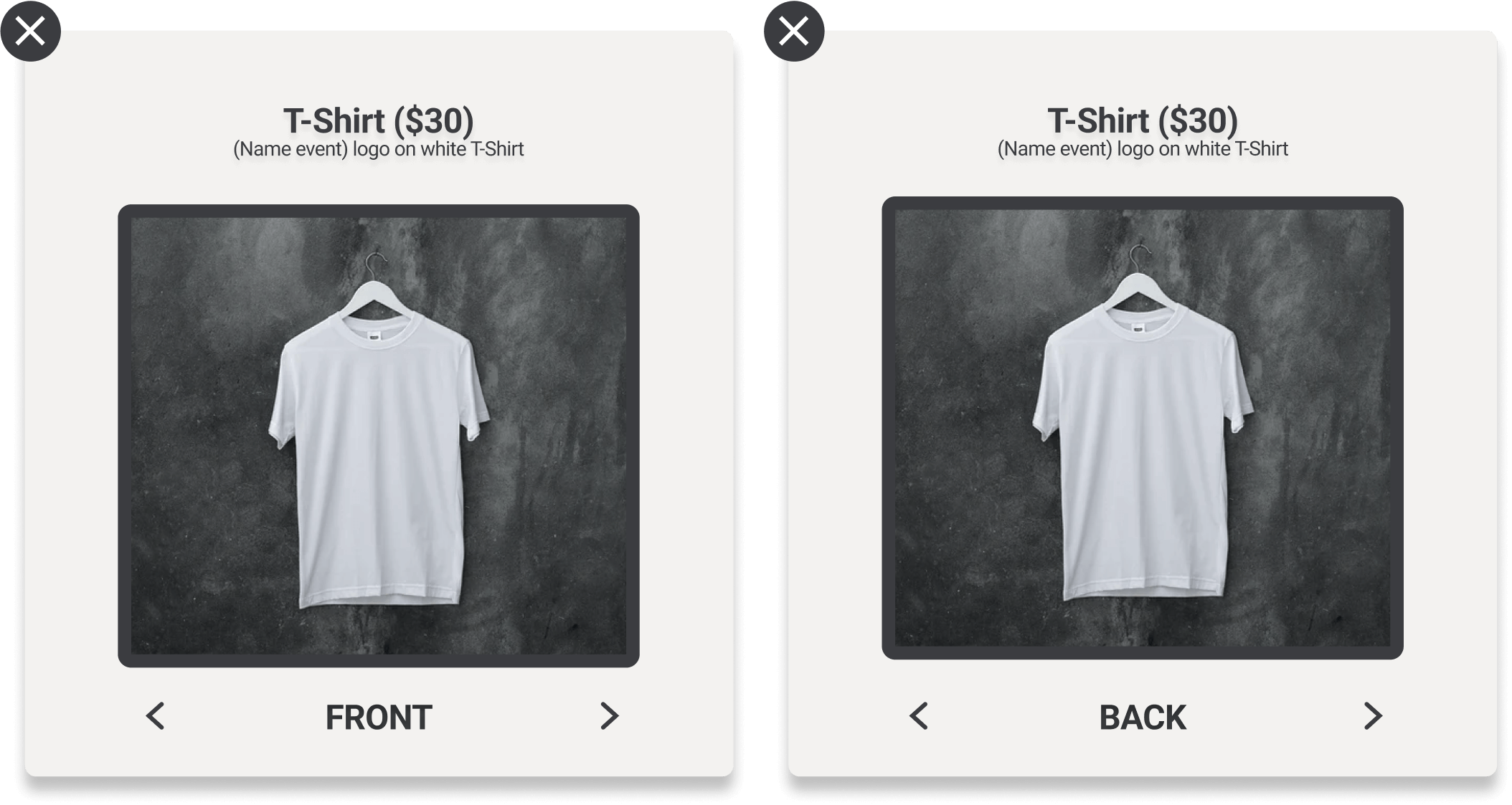
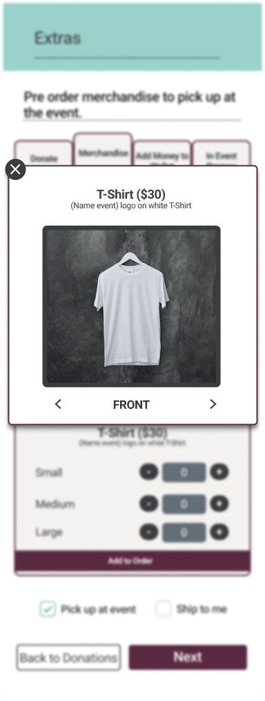
Merchandise

Page Where the Event-Goer Buys Merchandise
Before

After
- Changed out the dropdowns to plus or minus for quantities
- Added scroll for when there is more merchandise
- Included the option of picking up merch at event or shipping to person

Discounts


Added Various Instances of Discount Code Inputs: Success/Invalid
Order Details and Round-Up

Newly Added Order Details Section
The original design had the payment transact once the user selected Confirm Payment on the payment screen and was taken to the Confirmation Screen.

In order to give the user another opportunity to review their order in detail before confirming payment an Order Details page was added. The user can edit the different order components as necessary.

Round-Ups
Round-Ups are a newly added feature for the Event Owner to add to their event experience. We wanted to make sure this option stood out well for the event-goer during their check out so we highlighted this particular section in the Order Total.
Before


After
Confirmation Page

Confirmation Page Redesign


Changed the hierarchy in order of importance:
1. Sharing and inviting (important for business)
2. Downloading the app (important for business) and makes the user experience faster
3. Sending tickets to others
Mobile Design

Responsive Frames
Every desktop screen needed to be designed for mobile as well. These are some examples of desktop frames with their mobile counterpart.
Ticketing
For mobile, the selected tab is elongated to make it more apparent to the user which section they are currently viewing.

Donations
For mobile, if there are more than two causes to contribute towards, a carousel is formed in order to view the different options.

Merchandise
On mobile, the user can horizontally scroll to see the merch. When enlarged the pop-up blurs the background to make it more apparent it's a pop-up.

Order Details
When first landing on Order Details, the user sees the details collapsed. If they want to see their information in more detail they can expand the chevron.


Wrapping-up
To reiterate what was redesigned and updated for this user flow:
- expanding the ticketing options
- adding a donations section and round-ups to the end of the order
- redesigning the merch section with scrolling and the ability to ship to the user
- expanding the order details/summary
- updating the UI through the flow
- designing for mobile
Thank you!