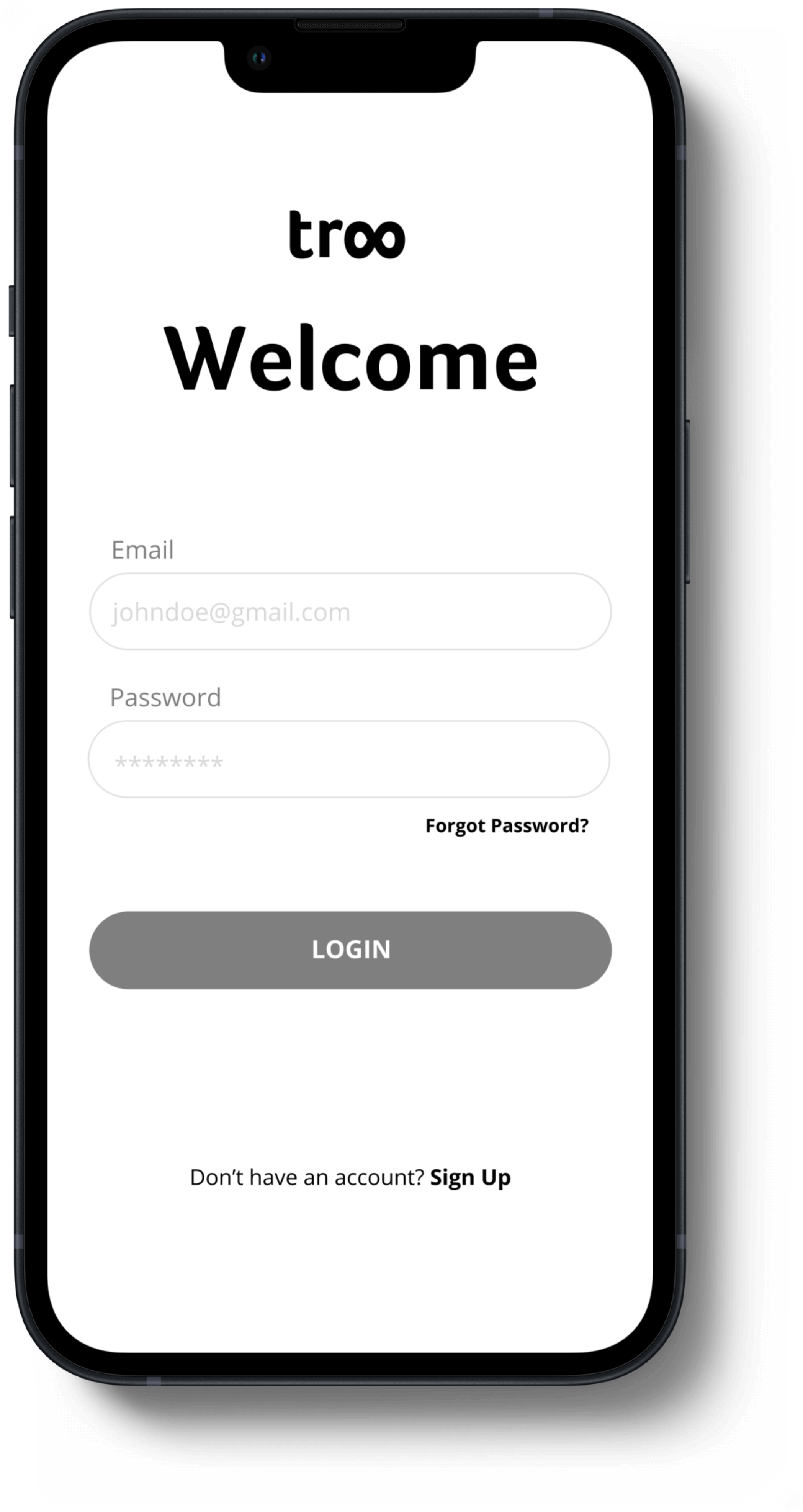
Troo Sign-Up Flow
User testing of sign-up flow
What's Troo?
Troo is an ethical social media platform
- Troo protects people’s privacy and data
- Troo wants users to be very intentional with the information they share with others and whom they decide to connect with
- Troo wants the user to have multiple profiles that cater to particular aspects of a person’s life/focus
My Role:
I am one of the UX designers out of two. We have a UX researcher, product manager, project manager, and two developers.
Troo is still in its initial design and development stage. This study describes one version of the sign-up flow that we will be testing.
The wireframes are in grayscale as we have not finalized our color palette yet.
We want to validate our hypotheses on what users want when it comes to privacy settings based on an initial survey of 96 participants.
Features Considered

- Onboarding slides
- Sign up with email or phone number
- Public/private account settings
- What icon to make profile info public/private?
- Username/Profile Name/Handle Name/Nickname/Screen Name
- Pronouns
- Verified profile
- Customization
- Multiple Profiles
- Profile creation- how many steps?
Onboarding Slides

Where to put in flow for testing?

We are going to demonstrate the onboarding slides at the beginning of the test. We will ask the users if what’s presented makes sense before they start the account creation process.
Sign-up Verification

Email or Code?
Since we are going to have people log in with their email it made the most sense for people to verify their account via their email as well. This way we don't ask them to provide their phone number.
We are going to test whether people prefer verifying from their email platform (one prototype version) or copying and pasting a code from their email platform into the app (the other version).

Privacy Settings


Part of Troo is making your info as public as the user wants- every piece of information. Out of 96 respondents of the survey, 53% said the more privacy settings the better.
How granular does the user want these settings to be?

We originally had the eye icon to indicate public/private. We decided to use the toggle icon as its function is more universally understood.
Profile Association

What’s in a name?
Some ideas considered for profile association:
Username/Profile Name/Handle Name/Nickname/Screen Name/Display Name
We chose Profile Display Name and Profile Handle.

Profile Display Name :
- What people see under the user’s handle in the search result
- What other users see when looking at your profile
Profile Handle :
- How users will be found on the app
- “Handle” is more universally known for social media platforms
- Required for user
Testers' Opinions

We are going to gather users' thoughts on the following areas:


Further Considerations

How many steps should there be to create an account?
30% of respondents say they would prefer as fast of a setup as possible

One prototype is broken up into two pages.
The other prototype has the sign-up process gated with the ability to skip certain sections with a total of seven steps.
This is another aspect we will be testing with the two different prototypes to get feedback on.
Testing Results

We’ve done four prototype interviews so far. Research has shown:
- Users prefer more gated rather than longer scrolls when signing up
- Would like a better representation of what Troo provides before continuing to build a profile during onboarding
- Would like a preview of the profile before actually publishing
- Like the multiple profile idea with intentionality but need to distinguish between profile types better
- Make it more apparent what information is required to start using the app
- Like the ability to set each piece of information to public or private
Possible Next Steps
Design distinguished profiles between types
ORHave users sign-up with email and password, a handle, and then be allowed to use the app? Get a reminder to finish building the profile from there.
This will allow them to decide with more intentionality what information they want to include in their profile after familiarizing themselves with the app.
From here, we'll do tests of the other prototype, synthesize data, and draw conclusions on how to iterate to one sign-up design.
Thank you!