Troo
A social media mobile app.
What's Troo?
Troo is an ethical social media platform
- Troo protects people’s privacy and data
- Troo wants users to be very intentional with the information they share with others and with whom they decide to connect
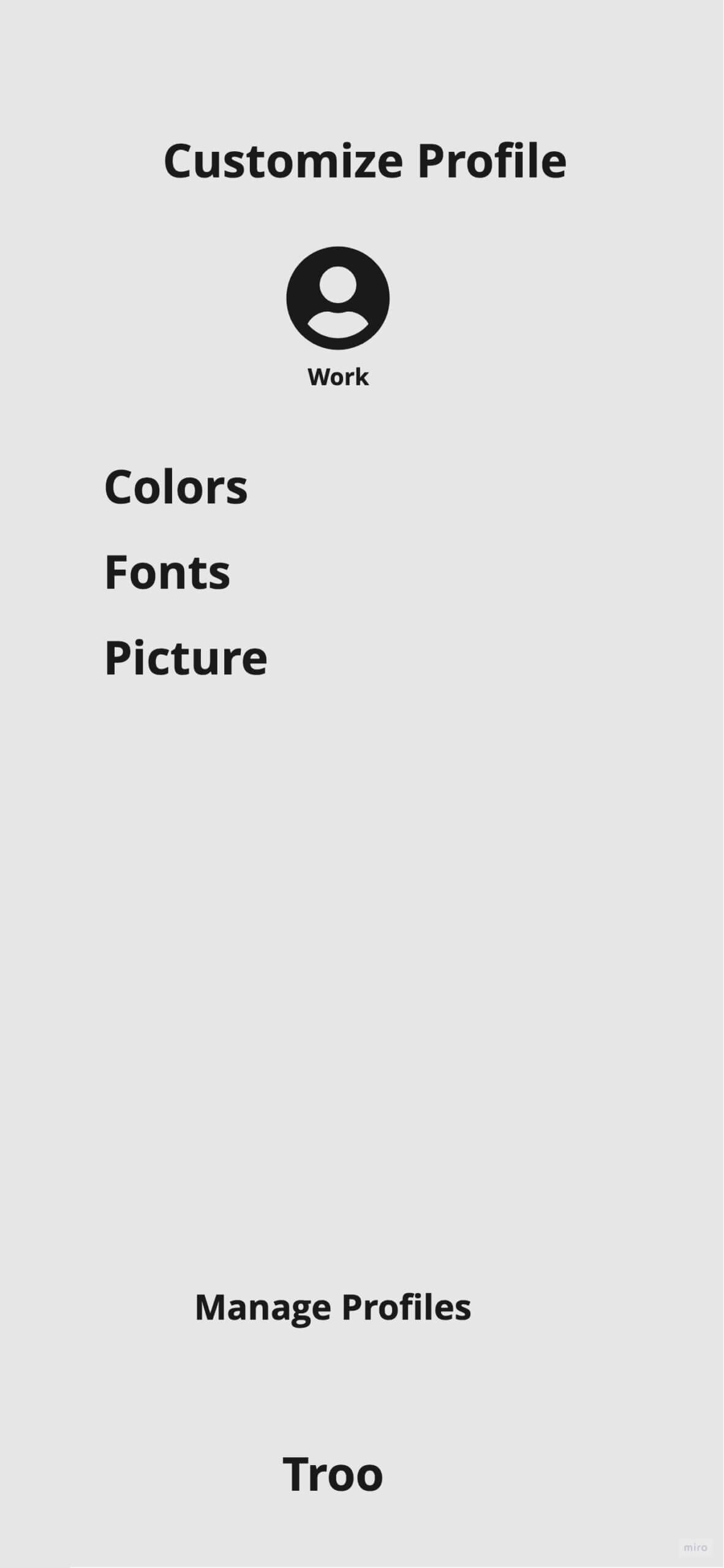
- Troo wants the user to have multiple profiles that cater to particular aspects of a person’s life/focus
My Role:
I am one of the UX designers out of two. We have a UX researcher, product manager, project manager, and two developers.
Troo is still in its initial design and development stage.
Examples of sketches and lo-fi wireframes resulting from brainstorming sessions are demonstrated below before we started focusing on specific flows to test and iterate.
Customer Journey Map for Instagram User
Recognizing positive and negative emotions during part of the user journey on a social media platform.
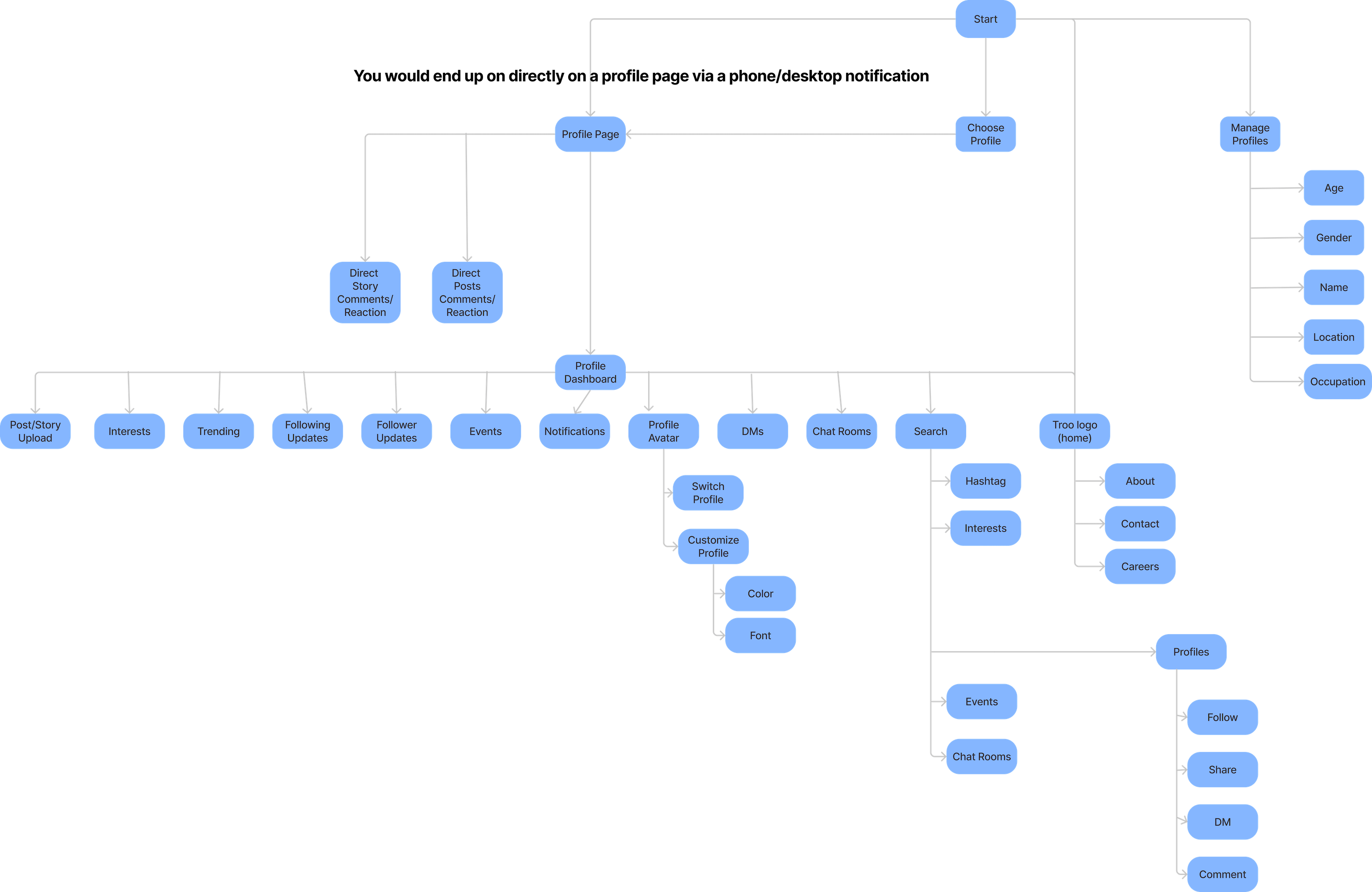
Site Map
Brainstorming Main Components of a Social Media App
What about?
Dashboard Layouts
Is this an opportunity to consider different dashboard layouts that the user sees when opening the app?
Accessing topics from the top or bottom?
Youtube's carousel layout for scrolling?
Accessing topics by sliding topics in from the left?
What about?
Scroll Limits
Troo wants to help users limit doom/addictive/endless scrolling.
What about?
Last Visit
Thinking about different ways for the user to return to their dashboard where they left off to help mitigate endless scrolling.
What about?
Creating Rooms from Posts
The idea is for the post viewer to create a chat room based on a post they've seen to increase direct social engagement.
What about?
Post Viewpoints and Settings
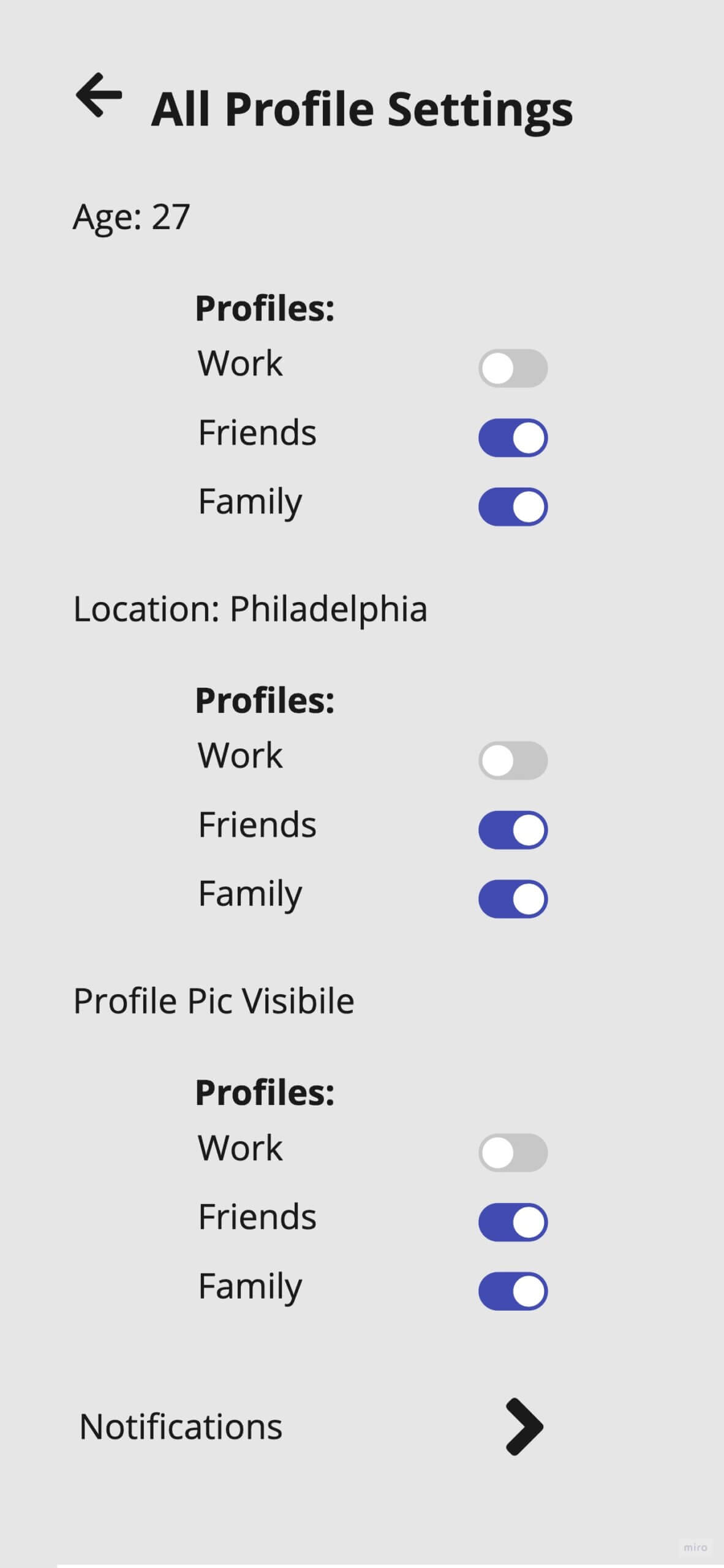
Troo wants the user to have control over who sees their posts.
The idea to separate viewers into Friends/Subscribers/Non-Subscribers is explored below.
Settings According to Connection Type
What about?
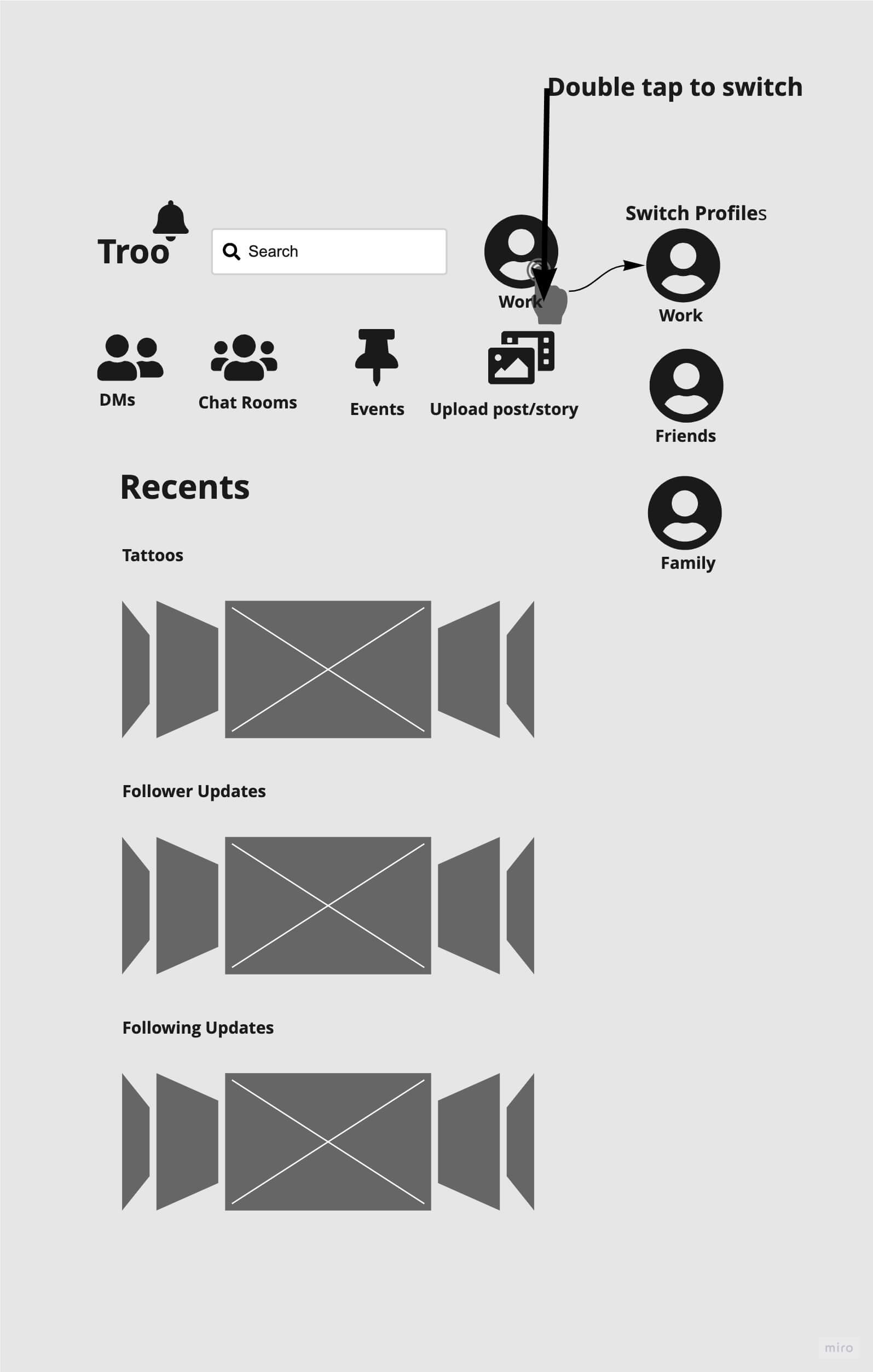
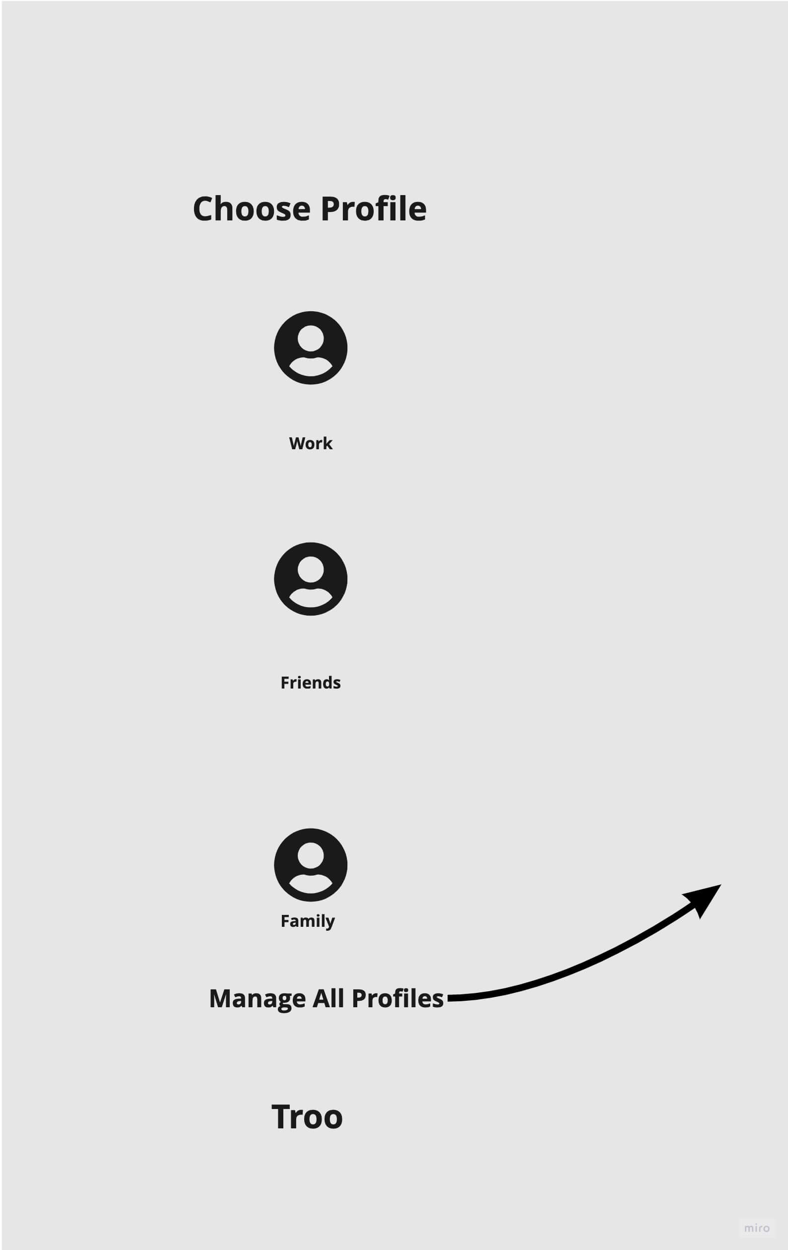
Switching Between Profiles
Troo users will be given the opportunity to create two separate profiles when creating an account.
What about?
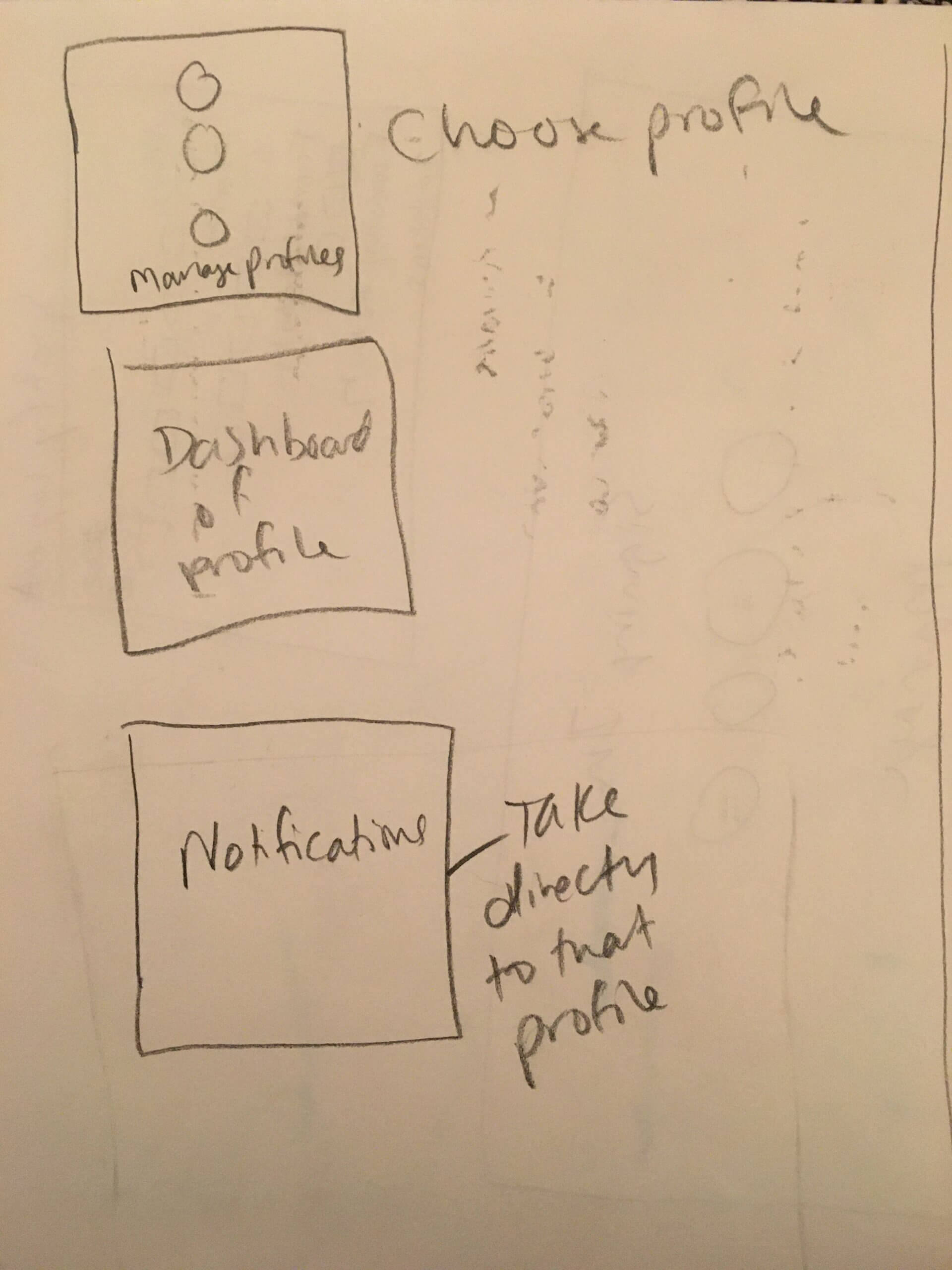
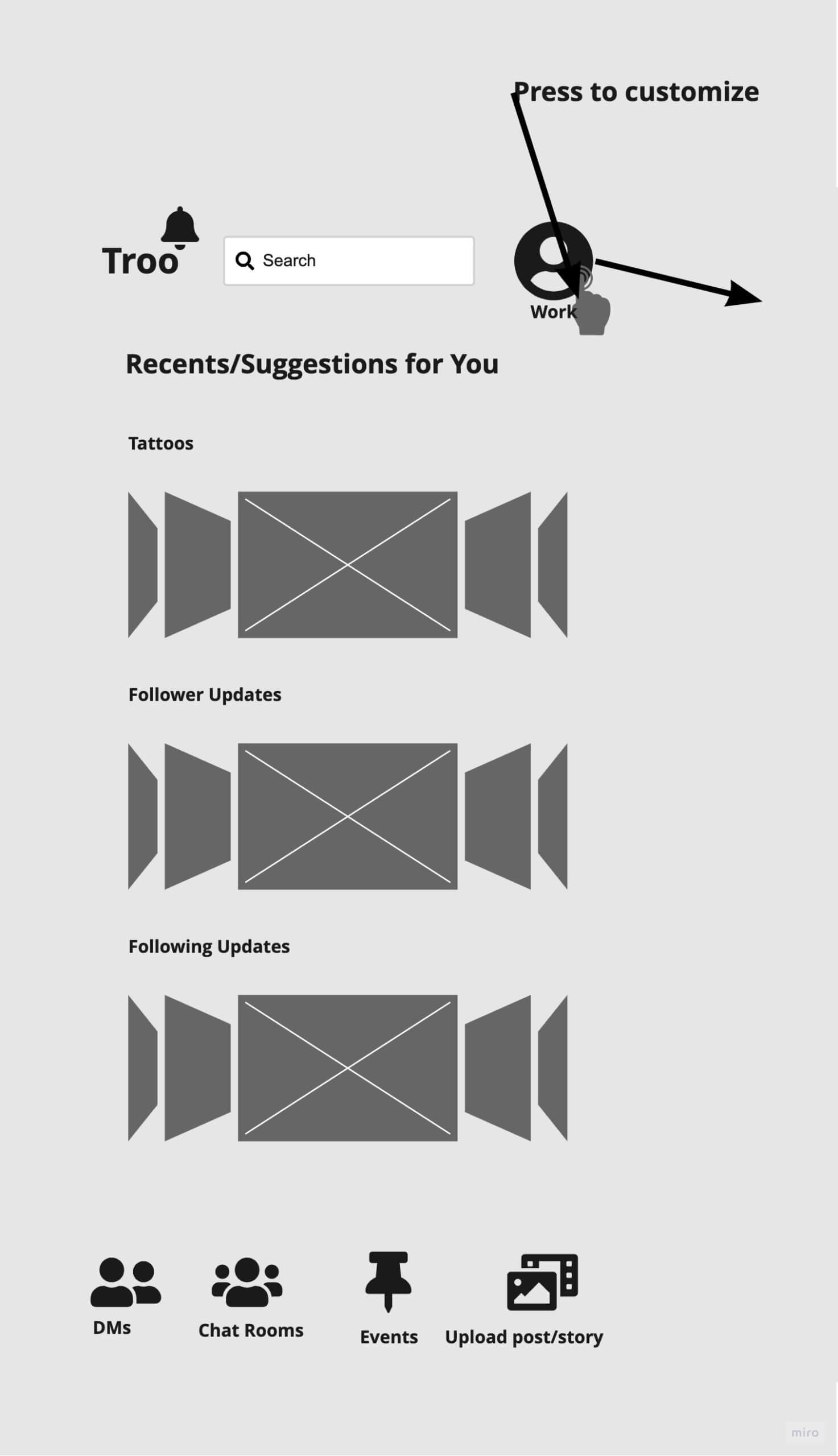
Profile Management
What about?
Sign-up
What about?
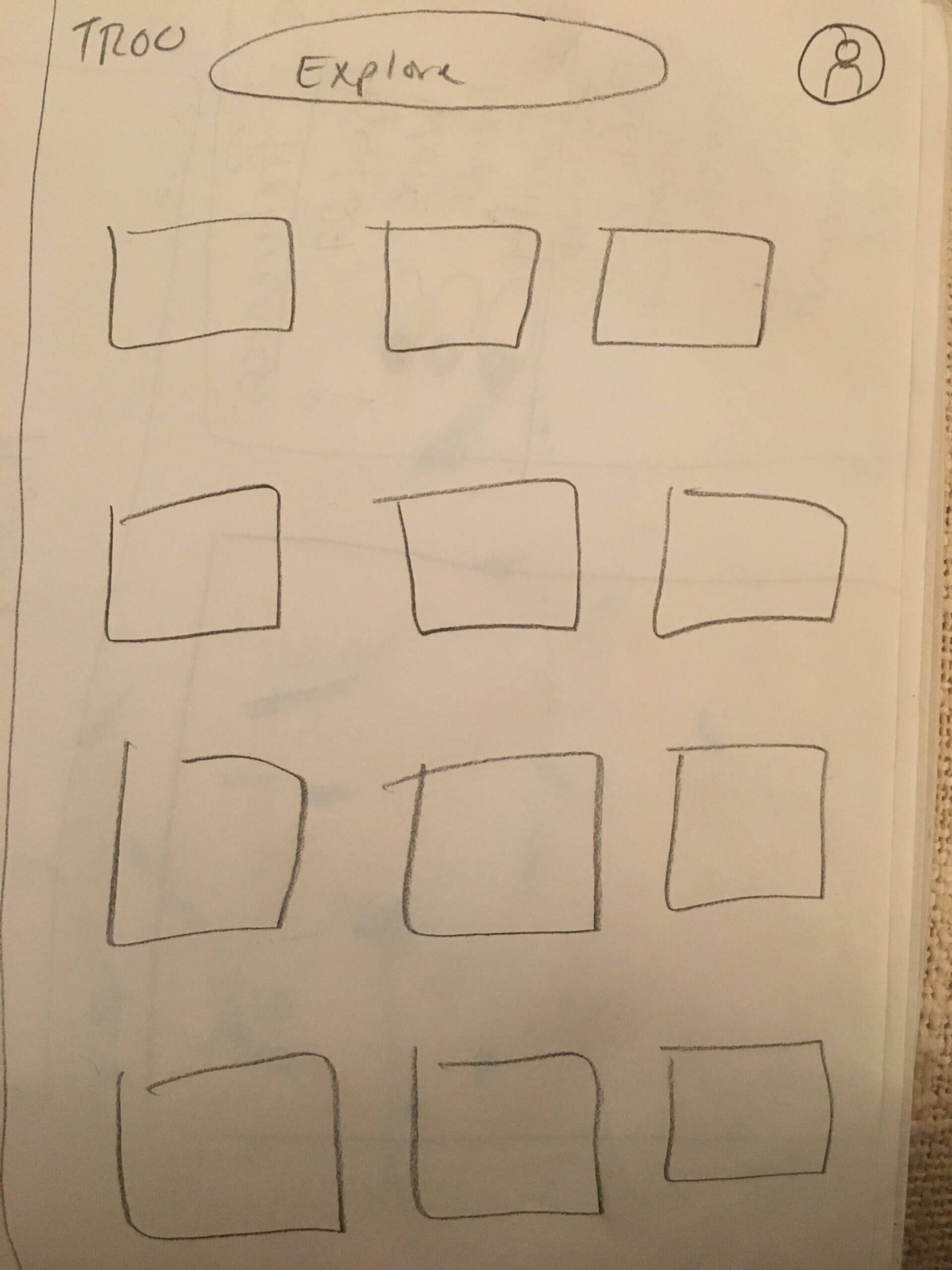
Explore Page
Inspired by Google's landing page for Search and wanting to be even more minimal.
What about?
Chat Function
The idea of incorporating a chat function within the app has been considered.
From Here
We'll start to focus on specific flows we want to finalize for our beta release. This will include lo-fi prototypes, user testing, and iterations from our findings.
